Friday, 31 January 2020

150 Experiments on the Call-to-Action: Six psychological conditions that hinder our results

“What you ask me to do is important, but when you ask me to do it has more bearing on whether I choose to comply or not.”

— Flint McGlaughlin, Managing Director & CEO, MECLABS Institute

(This article was originally published in the MarketingExperiments email newsletter.)

One of the fastest ways to increase your performance is to improve your call-to-action. We did a meta-analysis of 150 of our experiments to determine 6 cognitive conditions that can hurt conversion.

In this video, Flint McGlaughlin, CEO and Managing Director, MECLABS Institute, talks about three of those negative conditions the customer experiences when seeing a call-to-action. He shows you how to improve your CTA by lining it up more logically with your page visitors’ sequence of thought.

This session is loaded with practical case studies and examples, both good and bad, to help you avoid common CTA errors and give you ideas for your own webpages.

If you would like your own webpage diagnosed on one of our upcoming YouTube Live sessions, you can send your website info through this form, and we’ll try to fit it in.

If you would like to receive more detailed advice from a MECLABS conversion marketing expert via a video conference, visit our Quick Win Consult page to learn more.

Here are some key points in the video:

1:14 Which CTA won?

6:54 Key principle #1 – CTA is more than a button, it is …

9:23 Key principle #2 – CTA depends upon the context of …

10:27 6 negative conditions the customer experiences when they see a call-to-action

11:21 Cognitive condition #1: Apathy, and the root cause

13:12 Condition #1’s solution can be found in this case study: Defence contractor

18:00 Condition #2: Negative surprise and its root causes

19:42 Condition #2’s solution can be found in these case studies …

26:32 Two flawed “asks”

27:20 Here’s a checklist you can use on your webpages with criteria for a good CTA, and Condition 3: Too many choices.

29:38 The solution can be found in these case studies …

Related Resources

Effective CTAs: How the thought sequence of a call-to-action affects landing page performance

The 21 Psychological Elements that Power Effective Web Design

Call-to-Action Optimization: 132% increase in clickthrough from changing four simple words

Marketing 101: What is above the fold?

Get our latest research delivered straight to your email inbox. Subscribe here.


“In my 3 departments, I am responsible for promoting our 10+ conferences annually, 3 magazines, several newsletters, video, an annual forecast, keeping our website fresh, book publication, and coordinating closely with our lobbying presence in Washington, D.C. Time is always squeezed. That’s why I love MECLABS email. I know from the subject line if I need to read it (I usually do), and I know the material is sourced from great research. MECLABS gives me the best chance to keep up with the best thinking in communications.” 

— Rich Jefferson 
AMERICAN FOUNDRY SOCIETY

The post 150 Experiments on the Call-to-Action: Six psychological conditions that hinder our results appeared first on MarketingExperiments.


from MarketingExperiments https://ift.tt/2vCNjVj
via IFTTT

The Holy Grail: Email Send Time Optimization

Do people open your emails and delete them without a second thought? If most of your campaigns end up in the trash, then your timing — not your content — may be the culprit.

Email send time studies vary greatly on their conclusions. When the data from various companies was consolidated, it was found that midweek emails perform best, with optimal times ranging from 6 a.m. to midnight. That information may be accurate, but unfortunately, it doesn’t make the decision of when to send any easier.

Studies that recommend 60% of workdays and 75% of the 24-hour clock as the best times to send emails leave too much to the imagination. Under those guidelines, you could send an email at 10 p.m. on a Thursday or at 6 a.m. on a Tuesday, and both would be correct. That can’t be right — can it?

The truth is that the perfect email send time depends on your audience, your campaign, and your goals. A 6 a.m. Tuesday email might be great for a B2B newsletter, but it might not work for a flash sale on clothing. The infuriating answer to optimal email send time is, as usual, “it depends.”

Just because the answer varies doesn’t mean you can’t make smarter choices, though. By understanding the factors that impact your campaign performance, you can narrow your window and identify the perfect moment to deliver communications to your audience.

1. Unique time slot

If everyone agrees the best time to send an email is 9 a.m. on Wednesday, guess what? Everyone in the world will receive dozens of emails at 9:05 a.m. every Wednesday. People process information in batches, so most will see that long list of emails, glance through to make sure none of the subject lines include phrases like “Your payment is overdue,” and delete them all. 

You can’t follow the crowd if you want to stand out, and neither can your emails. Regardless of what time you choose, try sending your emails at an unusual time, like 9:17 instead of 9:00. After overwhelmed people delete all the emails from copycats, yours will come in by itself to demand their full attention.

2. Timely subject matter

Readers don’t want to waste their time on evergreen email content. Leave the long-term pieces for the blogs. Emails should encourage users to take immediate action, whether that means engaging with a longer piece of content, signing up for an event, or making a purchase. 

Your send time should reflect the nature of the action you want to inspire. Advertising for an event this weekend? Try sending your email on Thursday morning, around the time most people start making plans for their time off. For less immediate topics, target times when people have a few minutes to consume content or consider their options. Early morning, before and after lunch, and late afternoon work well for these purposes.

3. Geography and culture

The bigger your business grows, the more diverse your audience will become. You may not think much about optimizing email send times for a few dozen subscribers in different countries, but those people reached across the world to connect with you for a reason. They could be even more engaged than your local audience if you treat them with the same level of consideration. 

Adjust your email send times to reflect the living situations of your audience, if you have the data to do so. This follow-the-sun model, made popular by customer service teams, can work wonders for marketers who test and optimize for international sending. Pay close attention to distant audiences to see if their engagement rates beat the norms, then use your discoveries to inform your marketing tactics as your overseas audience grows.

4. A/B test results

Even the most well-researched plans can fail. You may have crunched the numbers, but if your emails on Saturday morning consistently outperform your emails on Wednesday afternoon, stop wasting money on tactics that don’t deliver results for your business. Your actual data, not theoretical advice from online experts, should be the brightest beacon for your email marketing strategy.

If email send time doesn’t seem to affect your open rates, take a closer look. That may be normal for companies with small lists filled with devoted fans, but as you grow, your email audience will inevitably prefer a few different times. Test some send times you normally wouldn’t expect to succeed, like evenings or weekends for a B2B company. You may discover that your data doesn’t look like everyone else’s.

King Content can’t rule effectively without Queen Distribution by his side. Instead of leaving your email send times to chance — or, worse, blindly following the crowd — do yourself a favor and look for opportunities to stand out. Optimizing your email send time is one of the fastest, easiest, and cheapest ways to boost your audience engagement and get your content in front of more people.


Sending your emails at the right times is just one way to ensure that they reach as many inboxes as possible and as many of their recipients as possible read them. See how to “Do More with Email Deliverability and Privacy.”

Check out the guideà


from Oracle Blogs | Oracle Marketing Cloud https://ift.tt/2uLs2IP
via IFTTT

Crunch Time for the Kansas City Chiefs Digital Team: How Oracle Eloqua Helped Them Score with Fans

The Kansas City Chiefs are headed to Super Bowl LIV. As an article just published by Forbes points out, the Chiefs’ success and thrilling playoff season has put increased pressure on the franchise’s content and media team. They have to continue to engage an already energized fanbase in new and intriguing ways to keep the excitement high and deliver fresh, special, and intriguing content on all of its platforms.

Over the past two years, the digital content and media team has tried several approaches to broaden and expand the fanbase both locally and internationally. They’ve experimented with long-form content, such as a team documentary series called The Franchise, and are keeping up with youth-oriented social network platforms, such as Instagram, Snapchat, and TikTok.

Game days see the intensity rise, as the team then has to put out content focused on making sure fans come out the game and get the most out of the experience. On Super Bowl Sunday, this intensity and pressure will hit meteoric heights. However, the team has remained calm, since they have been using Oracle Eloqua to connect fans to game day information via social media to help improve their experience.

In fact, Oracle Eloqua proved key in the digital content and media team increasing fan engagement by 200% and developed a following of more than 5 million fans all around the world across multiple digital platforms over the last two years and will help tremendously with their content this Super Bowl Sunday as well.

Oracle Eloqua, a part of Oracle CX Marketing, is marketing automation software that enhances buyer journeys with sophisticated lead and campaign management tools that equip marketers to send the right message at the right time on the right channel to the right customers.

To find out more about how Oracle CX Marketing can help you increase customer engagement and widen your reach across digital platforms, please visit us at: https://www.oracle.com/marketingcloud/.


from Oracle Blogs | Oracle Marketing Cloud https://ift.tt/2ObFFry
via IFTTT

Thursday, 30 January 2020

Take the Temperature of On-Site Customer Behavior with Oracle Maxymiser’s Heatmaps

Register today to join our webinar on February 26, 2020, at 11AM EST (US and Canada) to learn more about Oracle Maxymiser Heatmaps.

Business and customer insights are the foundation of an effective marketing strategy. That's why the Oracle Maxymiser team is excited to introduce the new Heatmaps tool within Oracle Maxymiser. Powered by Oracle Infinity, the Heatmaps tool sits natively within Oracle Maxymiser. You can easily launch it with a click of a button to better understand visitor behavior on your site, identify new test opportunities, and gain further insight into your Oracle Maxymiser campaigns.  

So, how does it work?

The Heatmaps tool provides a layer of contextual insight that can often be missed when simply looking at report data in isolation. For instance, if you are testing a re-designed homepage, and data tells you visitors aren’t clicking on certain content, Heatmaps can provide an understanding of the user behavior in relation to said content. With Heatmaps, you can visualize how customers are hovering and interacting more with content in certain areas. This can create opportunities to further optimize the re-design based on customer activity in order to drive your site KPIs.

And Oracle is already drinking its own Kool-Aid! According to Justin Collins, Global Web Marketing Director at Oracle, “Heatmaps makes it so easy for me to quickly get a visual assessment of where customers are engaging and what content piques their interest. Just by scanning the page, I can gauge, in real-time, what’s driving their attention and where I have opportunities to do further testing and optimization.”

Heatmaps allows users to visualize how customers hover and interact with content in real-time.

Getting under the hood of it, the Heatmaps tool is powered by Oracle Infinity Streams. Oracle Infinity Streams captures and delivers online events and complete visitor sessions, with real-time data visualization and activation. With unlimited data collection, Oracle Infinity ingests data using Javascript tags (a single line of code) and supports modular tag plug-ins to customize and enhance the data that is available. Oracle Infinity Streams can also be used in Oracle Maxymiser for in-session personalization which can personalize campaign content in real-time based on the visitor’s activity, such as last/most clicked, last/most searched, or add/remove items from basket. 

How Heatmaps can help you profit

The Heatmaps tool provides Click, Tap, and Scroll Heatmaps, along with an advanced side-by-side comparison mode, and filtering by Oracle Maxymiser A/B and multivariate test campaigns and attributes. Among the benefits:

  • Advanced side-by-side comparison mode with scrolling windows in unison that allow you to quickly compare two test variants or attributes, side by side.
  • Oracle Maxymiser campaign data filters to review the winning test variant, or even a variant that didn’t perform as expected, in more detail. You can also filter by attributes such as New versus Returning visitors, Geo Location, and Browsers.
  • Our superior visual editor with single page application (SPA) support provides a greater level of support across a wider range of websites. The Heatmaps tool is dynamic and displays correctly when the element appears on the page. This can be useful when reviewing hover menus, images within a carousel, or mobile webpages. 
  • Quick navigation to where your tests are running enables you to use the page’s drop-down to quickly jump between campaign URLs when filtering by Oracle Maxymiser campaign.
  • No integration or manual work required. As a marketer, any time you can save by not having to manually export/import data and load other tools, means more time to actually do your job, rather than trying to make tools work.
  • Oracle Infinity does not sample your data, so you always see the most accurate visualization of All your data at ALL times. 

Scroll Heatmaps visualizes scroll depth and how far down the page visitors scroll, while also providing an average page fold.


REGISTER FOR THE WEBINAR TODAY


from Oracle Blogs | Oracle Marketing Cloud https://ift.tt/2u5Pro2
via IFTTT

Wednesday, 29 January 2020

Omar Zenhom of $100MBA and Webinar Ninja (FS363)

Our guest today is Omar Zenhom. Omar is the co-founder and CEO of WebinarNinja. Founded in 2014, over a million people have attended a webinar on WebinarNinja and it was named as one of the fastest growing SaaS companies in 2018.

Omar is also is the host of the $100 MBA Show podcast. With over 90 million downloads and over 1,300 episodes, The $100 MBA Show is ranked as a top business podcast in over 30 countries.

In today’s episode, we cover how Omar grew the $100MBA podcast to 90 million downloads and how he built Webinar Ninja.

We also talk about how HARD business can be as you grow. Omar believes it gets harder not easier as you progress in business. It’s the easiest it will ever be when you get started (comforting and not comforting at the same time) And because it gets harder, at some point it forces you to change who you are….or you’re simply not going to make it. This is actually a good thing but it doesn’t feel that way at first.

Listen to the episode:

Subscribe to The Fizzle Show in your favorite podcast player:

iTunes | Overcast | Pocket Casts | Stitcher | Spotify


The post Omar Zenhom of $100MBA and Webinar Ninja (FS363) appeared first on Fizzle.


from Page Array – Fizzle https://ift.tt/2RzMYLA
via IFTTT

How to Form an Effective Hypothesis for Optimized Testing

A strong hypothesis is the cornerstone to any meaningful and effective test. Every hypothesis that is proven or rejected provides your business with valuable insights behind visitor behavior and continues to drive your optimization plan while supporting company goals and objectives.

Remind me, what exactly is a hypothesis?

Before we dive into the components and best practices you should keep in mind when crafting your hypothesis, let’s first discuss what exactly a hypothesis is. If you type “hypothesis” into Google, you’ll likely receive a definition similar to the below:

“Hypothesis: a supposition or proposed explanation made on the basis of limited evidence as a starting point for further investigation.”

In simpler terms, a hypothesis is a prediction you make before running an experiment or test. It is a statement that addresses a specific problem or question while also providing a suggested solution. 

Hypotheses should be informed by quantitative data (web analytics, past test data, campaign insights, audience insights, heat maps) and/or qualitative data (user testing, focus groups, customer support feedback). The hypothesis created based on this information will clearly state what is being altered, what the predicted outcome of this alteration will be, and the rationale behind that prediction. 

Ultimately, the outcome of the test will either prove or disprove your hypothesis.

So, how do I create my own hypothesis?

When beginning to craft your hypothesis, you’ll want to first ask yourself what the problem, question or reason for testing is. Once that is defined, you can then outline a clear description of what is being changed to address this reason, ending with the results you expect to see from this change.

For instance, if currently the click-through rate on your product details page is not at the rate that aligns with your business goals, you may want to perform a test that helps to address the underlying problem. An example hypothesis that may kick-off this experiment could be as follows:

Changing the product list on the search results page from a single column format to a dual column format will increase the number of product options visible and boost click-through to the product details page.

To ensure you establish a clear and meaningful business hypothesis, there are three components you will always want to include: 

  1. The change you are testing

  2. The results you expect to see from this change

  3. The specific audience you expect the change to impact

If you want to take your hypothesis a step further, it’s beneficial to include the following additional components:

  1. By how much of an impact you expect your change to have

  2. After how much time

What exactly do each of these components entail?

The change you are testing: This is the part of your hypothesis where you will clearly state exactly what change you will be making to your site and describe what will be tested. It is important to be as specific as possible here. Simply stating that you will implement a redesign is too broad – knowing exactly what elements make up the redesign will allow for a clear conclusion as to whether your hypothesis was proven or disproven. 

Don’t: Redesigning the search results page will increase click-through to the product details page.

Do: Changing the product list on the search results page from a single column format to a dual column format will increase the number of product options visible and boost click-through to the product details page.

The results you expect to see from this change: Here you will want to clearly state the impact you expect to see from this change, as well as what will be used to determine success. You want to be able to answer the question of how you know if your change is truly successful – will it increase purchase conversions? Increase form submissions? Reduce time spent before reaching the next page? The goal here is to ensure your hypothesis is specific and measurable.

Who will be impacted: It is important to define the audience that will be affected by your change. We don’t want to assume what you are testing will impact everyone that comes to your site, or will even be shown to everyone. This may in fact be the case, but often times it is not. It’s critical the audience you choose to include in your test makes sense depending on what it is you are testing, and this is a significant factor when it comes to getting clean data and results. That being said, we will want to define this audience within our hypothesis as well.

Example: Displaying a pop-up modal on the homepage, to unsubscribed visitors, with messaging that encourages visitors to sign-up for our newsletter will increase newsletter subscriptions.

The above example clearly tells us that the experiment will be tested on unsubscribed visitors to the site, and will allow us to better conclude if the experiment was successful for these group of visitors when analyzing the results.

By how much of an impact you expect your change to have: Including this component in your hypothesis will better allow you to assess whether or not your hypothesis passes or fails. For instance, rather than just stating that your change will increase purchase conversion rate, it is extremely effective to also include by how much you expect this change to increase your purchase conversion rate. This will often be an estimate, but it is still helpful to include as you will have a clear measurement for whether or not the change you are testing is successful. This will also help you estimate for how long you should run your test for.

Example: Changing the form fields within the checkout funnel from a single column format to a dual column format for all visitors will increase the purchase conversion rate from 80% to 83%.

After how much time: Including an estimated duration of the experiment into your hypothesis will allow anyone who is analyzing the results to understand that the data is not valid until the set duration has passed. This does not necessarily have to be set based off of time, but can also be defined by other measurements such as reaching a certain number of sign-ups, purchases, page views, or after a marketing promotion may be over. Sound CXO systems and service teams should also have a sample size calculator which will assist with this calculation effort.

If you’ve included all of the above components in your hypothesis, you’re on your way to designing a meaningful and effective test. If you want to get the most out of your experiment and the results, it’s all going to start here.


Want to learn more about how the Oracle Maxymiser Consulting team can take your optimization program to new heights?  The Oracle Maxymiser Consulting team is made up of passionate strategists, designers, developers, quality assurance professionals,  trainers, analysts, and platform experts. We’re excited to understand your business needs and work with you to drive ROI.

Contact us here or find out more information about Oracle Maxymiser (and the rest of the Oracle Marketing Cloud suite) at our home on the web


from Oracle Blogs | Oracle Marketing Cloud https://ift.tt/2O6q24I
via IFTTT

Tuesday, 28 January 2020

Dark Mode for Email: How Marketers Should Adapt

Dark mode is a major trend in user interface experiences across a wide range of apps, including email clients. As support for dark mode continues to grow, the question that our clients are asking us is: Should my company change its designs and code to be compatible for dark mode for email and, if so, exactly what changes should we make?

Before we answer that question, let’s take a step back and address the basics, like...

What Is Dark Mode?

Instead of the usual dark text on a light background, dark mode features the inverse: light text and a dark background. You can see the difference below in how Oracle Marketing Cloud’s Twitter page renders in both light mode and dark mode.

What’s Driving Dark Mode’s Popularity?

While it’s unclear if dark mode is better for you or not, several things are clear:

  1. Dark mode is easier on your eyes in low-light environments, such as reading in bed with the lights off or coding emails in a work or home office with the lights off and shades drawn. Dark mode is definitely part of conversation about office ergonomics, such as the rising popularity of standing desks.

  2. It can extend the battery life of your device if it has an OLED screen. However, it doesn't save power at all if your device has an LCD screen, which most laptops and all but the most recent smartphones do.

  3. Some people prefer it because they’re sensitive to light or have cataracts, so should probably think of dark mode as being part of inclusive design. However, the biggest reason appears to be that some people simply like it better. And in a world where we want to give people choices.

While some people use dark mode all the time, some use it situationally and others not at all. But it’s popular enough that support has exploded.

Where Is Dark Mode Supported?

Design software like Adobe Creative Suite and many photography websites and programs have used dark mode for years and years. But now support has really taken off, with the latest versions of Windows, macOS, iOS, and Android all support dark mode. 

That has allowed some of the most popular apps and websites to embrace dark mode, including Amazon Kindle, Chrome, Facebook Messenger, Firefox, Medium, Pinterest, Reddit, Slack, Twitch, Twitter, and WhatsApp, among others.

Email clients have also added support for dark mode over the course of the past year or so. Apple Mail and the flavors of Outlook and Gmail have led the way. Generally speaking, approximately half of all emails are opened in environments that support dark mode, according to October 2019 data from Litmus’s EmailClientMarketShare.com. Again, the key word there is “support,” since usage varies.

Regardless, the potential audience is large.

Do You Need to Worry about Dark Mode for Email?

Dark mode can seriously mess up how your emails render, making text unreadable in some cases. Depending on the email client, dark mode either fully or partially inverts colors

You can see the differences in how Apple Mail 12 and Outlook 19 implement dark mode affected the Oracle CX Marketing Consulting newsletter below. Whereas Apple Mail’s dark mode affects only the app’s interface (in this case), Outlook’s dark mode affects the email pretty dramatically, making portions of it hard or impossible to read—at least prior to us implementing some fixes that we’ll discuss later.

“I am seeing the most frustration with how dark mode is done in Outlook (macOS), Outlook.com, and in Outlook on mobile for iOS,” says Lauren Beltramelli, Email and Web Developer for Creative Services, Oracle CX Marketing Consulting.

It’s so messy that we recommend that marketers seriously question whether it’s worth the extra design development time to design/code around dark mode. However, if a lot of your subscribers are reading your emails on Outlook email clients, then you’ll want to take action.

How Can You Adapt to Dark Mode for Email?

First, let’s recognize that this is a relatively new trend and therefore unsettled. In working with our clients, we’ve seen lots of dark mode advice that was meant for web development only and other advice that possibly worked at one point but doesn’t anymore. We hope that implementations of dark mode in email will standardize over time, but we know that could take a while.

Let’s also recognize that marketers need to respect consumers’ choices regarding whether to use dark mode. We should let them pick the user experience that’s going to work best for them and then adapt accordingly. 

“Forcing your email to stay in light-mode isn’t a good answer,” says John A. Lillard, Principal Consultant for Implementation Services, Oracle CX Marketing Consulting. “It’s better to let your clients choose.”

With that in mind, and based on what works right now, here’s our advice:

1. Add Strokes to Logos and Icons

Adding a stroke to your logo in the same color as your background color makes it effectively invisible in light mode. However, when dark mode is turned on, that stroke keeps your logo from blending into the background. Given how important it is to be instantly recognizable in the inbox, you’ll want to do this to maintain brand trust.

You can see the effect that adding a 1 pt. stroke—plus glow—to our logo had on the Oracle CX Marketing Consulting newsletter.


2. Watch Your Background Colors

Dark mode changes text colors and background colors, too, but not always in a way that makes the text legible. Test the rendering of your emails across inboxes or by using Litmus, Email on Acid, or another service to see if you have any bad text–background color combinations.

Background images are a common element of bulletproof buttons, which maintain their integrity when images are blocked, so pay extra attention to how dark mode affects your calls-to-action. The last thing you want is for your CTAs to disappear or become suspicious. 

3. Watch Your Background Images, Too

Given the layering effects that dark mode causes, background images can cause legibility issues. If you’re going to use them, be sure to test the rendering.

4. Consider Transparent .PNGs

In some cases, using a transparent PNG can help a background color that’s turned dark in dark mode darken the PNG, allowing text that’s been turned light to be legible. Again, this is a case where rendering testing is key to identifying these situations.

5. Consider White or Light Font Colors

While background colors and images are half of the legibility equation, the other half is font color. And here dark mode behaves a bit more predictably.

“What’s dark goes light, but what’s light tends to stay light,” says Eric Santiago, Email and Web Developer for Oracle. "That's especially true if you're using pure white."

You can see how this can play out in our Oracle CX Marketing newsletter below. In the hero module, the white text that we use is unaffected by dark mode, staying white. However, in the second module, the headline that is in #000000 black is inverted to pure white and while the copy under it is inverted from #312d2a to a light gray that becomes unreadable in this case.


6. Plain-Text Emails More Likely to Be Affected

For better or worse, plain-text emails are more susceptible to dark mode changes, at least in some email clients. For example, Apple Mail’s dark mode only affects plain text and HTML emails that are so lightly coded as to be effectively plain text, says James Wurm, Head of Coding Services, Oracle CX Marketing Consulting. 

“So for most marketers, their promotional emails won’t be affected, although some of their transactional emails might,” he says.

7. Selectively Add -webkit-text-fill-color to Your Inline Styles

A fix that works for Outlook 2019 for Mac only is to add -webkit-text-fill-color to the inline styles for your text blocks that are adversely affected by dark mode. This overrides dark mode’s color inversion, allowing you to keep your text color unchanged in that email client.

Here’s an example of it being used in the code for our newsletter:

<div style="font-family: 'Open Sans', Arial, Helvetica, sans-serif; color: #312d2a; -webkit-text-fill-color: #312d2a; font-size: 15px; line-height: 20px; font-weight: 600; text-align: left;" class="fs_16 lh_20"><i>Powered by Oracle CX Marketing Consulting</i></div>

8. Selectively Use Graphical Text, Plus Alt Text

“The only thing that works 100% of the time to counteract dark mode is putting your text in images,” says Beltramelli. “If you have an all-image email, in dark mode it will look the same as in light mode.”

That said, we’re not recommending that our clients move to all-image emails. After all, all-image emails don’t look good when images are blocked and can contribute to deliverability problems.

However, if a particular module or portion of your email is getting is not legible because of dark mode and our other tips aren’t helping, you might consider converting just that section into all-images. Just be sure to add alt text to those images to help with image blocking and deliverability.

Whichever combination of those eight potential solutions you decided to use, keep in mind that there’s no such thing as perfect rendering when it comes to dark mode. The goal is better. Did your adjustments make your email more legible in dark mode for email? If yes, then that’s a success.

While some of the adjustments you’ll want to make are situational, you’ll want to bake some of them permanently into your email build process. If you don’t make changes now, but sure to account for dark mode when you redesign your email templates next or roll out a new modular build architecture, says Jason Witt, Senior Creative Director for Creative Services, Oracle CX Marketing Consulting. 

“We are seeing some clients optimize components of their email architecture to accommodate for dark mode and others that are redesigning their email templates from the ground up to account for the effects of dark mode,” he says. “Either way, brands will need to account for how their logos, iconography, colors, live text, and imagery will be affected to ensure a great subscriber experience.”

—————

Need help optimizing your email designs? Oracle CX Marketing Consulting has more than 500 of the leading marketing minds ready to help you to achieve more with the leading marketing cloud, including Creative Services and Coding Services teams.

Learn more or reach out to us at CXMconsulting_ww@oracle.com

To learn more about email marketing and the tools to make it successful, visit us at: https://www.oracle.com/marketingcloud/.


from Oracle Blogs | Oracle Marketing Cloud https://ift.tt/2Uav6IO
via IFTTT

How to Check if Google Manually Reviewed Your Site

Do you know how Google decides what website should be ranked number 1, 2, 3 and so on for any given keyword?

Well, they have an algorithm for that.

But as you know, algorithms aren’t perfect. That’s why Google continually tries to improve it.

One way that they try to improve their algorithm is through Search Quality Raters.

What’s a Search Quality Rater?

Google knows that they can always make their search results better. And one way is to have humans review their listings for any given keyword.

So, all around the world, Google has people who manually review websites. And they review each website based on these guidelines.

It’s kind of long and extensive, but it is important that the Quality Raters don’t directly impact rankings.

Instead, they give feedback to the engineers who code up the algorithm so they can make it more relevant to searchers.

Now, the real question is, how do you know your site is being reviewed?

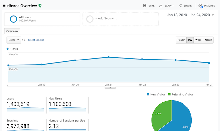
First, I want you to log into your Google Analytics account and go to the audience overview report.

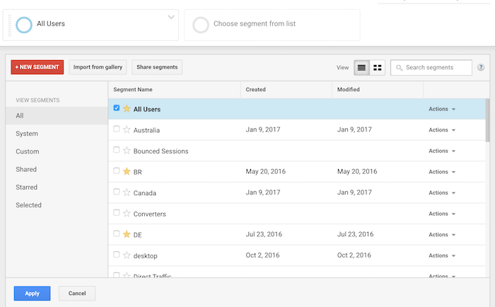
Then click on “Add Segment.”

Your screen should look something like this:

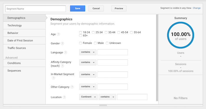
Then click on “+ New Segment.”

Your screen should look like the image above.

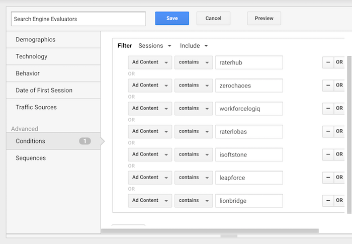
I want you to click “Conditions,” which is under the “Advanced” navigation label. Once you do that, fill out everything to match the screenshot below and click “save”.

Just make sure that when you are filling out the table you are clicking the “or” button and not the “and” button.

Now that you’ve created the new segment, it’s time to see if any Quality Raters have viewed your site.

How to spot Quality Raters

When you are in Google Analytics, you’ll want to make sure you select the segment you just created.

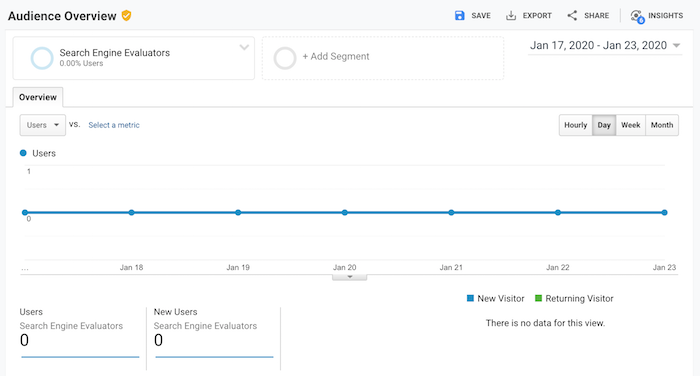
If you copied my screenshot, you would have labeled it “Search Engine Evaluators.” And when you select it, you’ll probably see a graph that looks something like the image below.

You’ll notice that no Quality Raters have been to my site during the selected date period, which is common as they don’t visit your site daily and, in many cases, they don’t come often at all.

The other thing you’ll notice is that next to the “Audience Overview” heading, there is a yellow shield symbol. If your symbol is green, then that’s good.

Yellow means your data is being sampled.

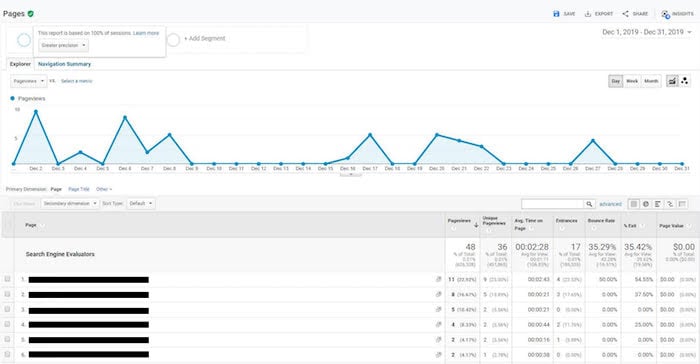
If you see the yellow symbol, reduce your date range and you’ll eventually see a green shield next to “Audience Overview” like the image below.

In general, it is rare that Quality Raters view your site each month. But as you expand your time window, you’ll be able to spot them.

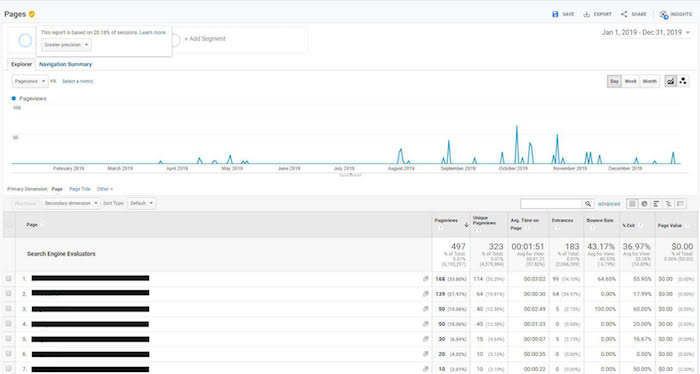
And once you spot them, you can shorten the date range so the data isn’t sampled and then drill down to what they were looking at on your website.

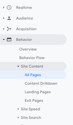
The key to analyzing what Quality Raters are doing on your site is to look at the “Site Content” report in Google Analytics and that will help you produce results that look like the screenshot above.

To get to that report, click on “Behavior,” then “Site Content,” and then “All Pages.”

What do I do with this information?

The goal of a Quality Rater is to help improve Google’s algorithm. And whether they have visited your site or not, your goal should be to make your site the best site in the industry.

You can do so by doing the following 3 things:

  1. Follow the quality guidelines that Google has released. It’s 168 pages long but, by skimming it, you can get a good understanding of what they are looking for.
  2. Always put the user first. Yes, you want higher rankings, but don’t focus on Google, focus on the user. In the long run, this should help you rank higher as Google’s goal is to make their algorithm optimized for user preferences over things like on-page SEO or link building.
  3. Check out Google’s advice for beating algorithm changes. In that article, you’ll find a breakdown of what Google is really looking for.

Conclusion

If you have Quality Raters browsing your site from time to time, don’t freak out. It doesn’t mean your rankings are going to go down or up.

And if you can’t find any Quality Raters visiting your site, don’t freak out either. Because that doesn’t mean that you won’t ever rank well in Google.

As your site gets more popular, you’ll notice a higher chance of Quality Raters visiting your site over time. This just means that you need to focus more on delighting your website visitors. Create the best experience for them and you’ll win in the long run.

So, have you spotted any Quality Raters in your Google Analytics?

PS: Special shoutout to Matthew Woodward who originally brought the Google Quality Raters segmentation to light.

The post How to Check if Google Manually Reviewed Your Site appeared first on Neil Patel.


from Blog – Neil Patel https://ift.tt/310x9AI
via IFTTT