Mobile adds a challenging layer of complexity when optimizing your online marketing funnel. Testing a winning desktop experience can often produce the opposite effect on mobile performance, leaving us to diagnose where and why our good idea went wrong.
We know that users interact differently on mobile and that there are slightly differing variables at play. Yet with the rapid evolution of the space, the exact nature of those differences are still being discovered. Below you’ll find some of the mobile discoveries we’ve made in the last year of testing. And to help you put these discoveries into action, we’ve created the free MECLABS Mobile Micro Course.
Discovery #1. Design for your customer
On the extreme end, many webpages and offers try to accomplish too much. The eye path is cluttered with competing ads and calls-to-action, a saturation of colors and images, and too many boxes and options — all of which distract the user. Another extreme is when marketers fail to address critical questions in the mind of the consumer. Webpage space is peppered with hero images, irrelevant art, artistic code and design and generic qualitative claims.
For desktop, and especially mobile since concision is key (as discussed later in this article), a webpage’s objective(s) is the barometer you use to measure the relevance of your design and page elements. The goal of your page should be narrow enough to avoid confusing and overwhelming the customer. Yet your design and copy should contain enough relevant value to keep users engaged and progressing toward a macro-conversion.
Design and copy can showcase our style, but ultimately, it’s all for the customer. A webpage should be designed to perform, not to impress. Usability and clarity trump clever design every time. This is not to say that page design is not important, but that each element of the design should support and contribute to the core message — and that core message itself is the sum of your perceived value proposition.
If a significant portion of your traffic is mobile, then it is important to treat mobile as a separate experience since users almost always behave to some degree differently than on desktop. If your traffic is predominantly mobile, then don’t treat mobile as the secondary experience; treat it as the primary. Usability is even more important for keeping consumers engaged in mobile since mobile is a compressed customer experience.
“If mobile is your primary audience, always design mobile first. Your mobile audience should not get a lesser experience if they are your primary [or significant] audience,” said Jonathan Yates, Digital Marketing Lead at MECLABS Institute.
Discovery #2. Long-form is not your enemy, irrelevance is
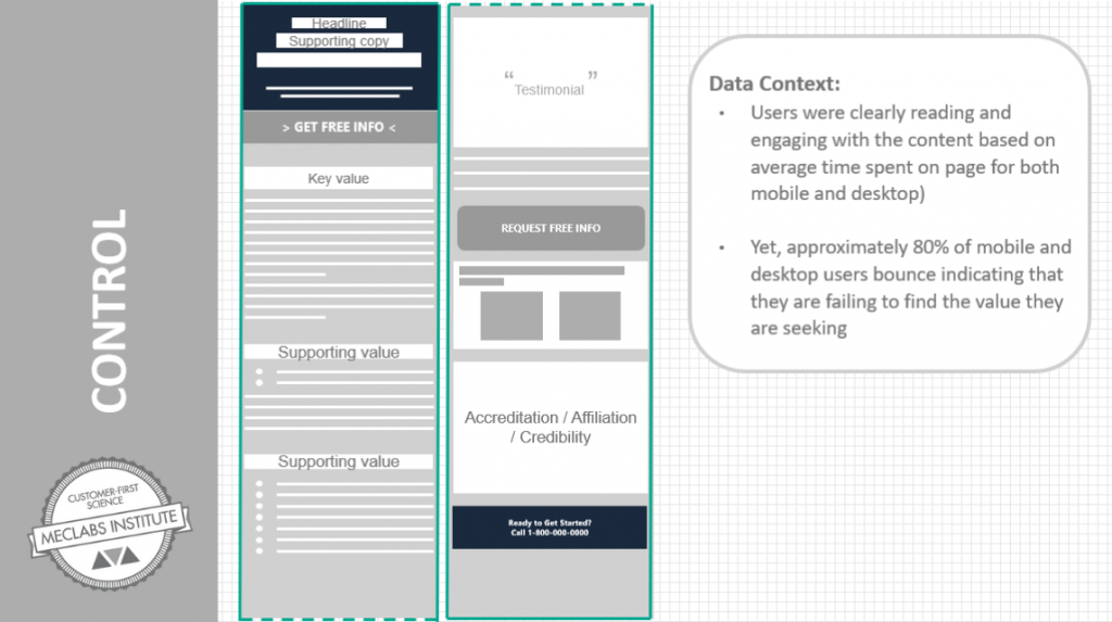
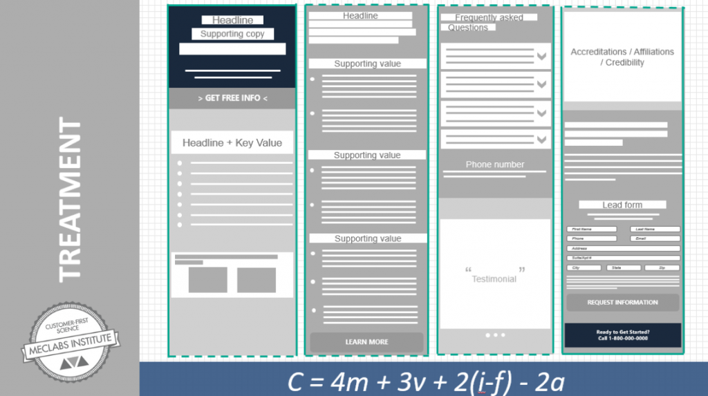
Take a look at this example from a test conducted for a well-known university seeking to increase enrollment:
In our analysis of the control page, we determined that while customers are motivated and interested, the messaging and sequence of information fails to provide a clear, controlled thought sequence that matches the key questions in the mind of the consumer.
To optimize the thought sequence on this page, not only was the information resequenced to better match the user’s thought sequence but against many mobile best practices, information was added to create a longer-form page.
While marketers often shy away from information-heavy mobile design, it isn’t the amount of information that influences user engagement, but rather the perceived relevance of that information. It is far more important to understand the necessary sequence of questions and conclusions in the mind of the user than to adhere to rigid best-practice-rules.
There is an inverse relationship between the complexity of a product or service and the amount of information required to make a purchase a decision. When communicating a more simple, transactional product, less information might be sufficient. But failing to provide enough information can be equally detrimental to conversion as overwhelming the customer.
In this case, the longer-form version with revised messaging produced a 32% increase in conversion rate.
“Don’t be afraid to have a longer page. If the content is valuable and relevant, prospects will read it. Just remember to make it clear …” Yates said. (He led the marketing experiment above.)
Discovery #3. [BUT] Concision is critical
While the amount of information should be informed by the questions and micro-decisions on the part of the consumer, it is the marketer’s responsibility to make that information as easy as possible to consume.
In the test above, more information was added but also translated from desktop-style long-form paragraphs to simple, easy bullet points with clear headlines and visuals to guide the user. Put simply, the customer should inform what and how much information is needed, but the marketer should design the information in the clearest, simplest and easiest format for the customer.
Mobile is a compressed customer experience. On the desktop, a user has greater autonomy over how they choose to experience a page since the eye path can vary due to screen-size and design. However, in mobile, the customer experience is necessarily sequential and linear — meaning that the customer experiences one page element at a time instead of multiple competing elements. This is why it is critical to ensure that the information presented is relevant, easy-to-digest, and aligned with the customer’s sequence of questions and conclusions.
Countless marketing mistakes are made because of assumptions based on insufficient data or rationale, and every marketer should be skeptical toward the litany of “best practices” and noisy ideas in the marketplace. Mobile shopping and browsing continue to grow and become ever more important, and the only way to truly understand it is through testing.
Understanding always trumps ideas over time. There are common variables and important differences between your desktop and mobile user behavior that vary depending on your product, model, industry and audience. So, to be truly effective in mobile, we must treat mobile as different and seek to understand how, to what degree and why.
Stay tuned for more research and insights as we continue to learn about what works in mobile marketing and why.
Related Resources
Most Popular MarketingSherpa Articles of 2018
Mobile Ad Campaign Optimization: 6 tactics from a high-performing marketer to increase conversion
MarketingSherpa Podcast Episode #1: The role of the human connection in your marketing
The post Exploring the Mobile Customer Experience: Three discoveries for designing an effective mobile experience appeared first on MarketingExperiments.
from MarketingExperiments http://bit.ly/2BrkHi1
via IFTTT


No comments:
Post a Comment