You know your niche and understand your customers. You’ve also taken the time to research keywords and optimize your copy. Then you’ve checked that your website works as it should.
Before you go any further, though, there’s an additional step to take: considering the colors and color combinations you use on your website.
We’re not just talking about branding or what looks good here: We’re talking about color psychology and the impact it can have on your visitors and subsequent conversions.
You may not realize there’s more to color than its aesthetic qualities.
The color scheme you use is a crucial part of the buying decision. Even minor adaptations like changing your CTA buttons’ color can dramatically increase your success rates, while your overall color scheme can increase brand recognition.
Let’s cover the impact of color psychology on consumers and how you can use it on your website.
What Is Color Psychology?
Color psychology is the science of how color affects human behavior. It is a branch of the broader field of behavioral psychology. In practice, it’s the science of how color affects human behavior and responses.
The psychology of color can influence how your customers respond to your marketing messages based on the color of your copy, call-to-action buttons, and links.
It’s all part of understanding the customer mindset. However, not every individual responds to colors the same way. This means there are no guarantees for its effects on conversions and branding.
However, it doesn’t mean you should dismiss color psychology and its impact. On the contrary, there are vital facts that are indisputable.
For example, studies show consumers take just milliseconds to form their views on your website’s visual appeal. In addition, color is powerful enough to elevate and evoke moods.
It doesn’t matter what niche you’re in, either. Whether you’re selling clothing, digital cameras, or tech services, it’s essential to make sure your colors work perfectly with every element in your marketing plan. Unfortunately, that’s not always straightforward, since choosing colors is an “imperfect art.”
Here’s what you need to know to make the most of this field.
Misconceptions About Color Psychology
Although there’s little in the way of scientific evidence, there is plenty of consumer research available on color psychology. For instance, one study shows color influences the buying decision.
However, it isn’t a one-size-fits-all solution. The impression a color has can vary depending on the purpose of your advertising and consumers’ age groups.
The impact can vary due to other factors, like:
- The industry you’re selling in.
- The culture you’re selling to and people’s personal beliefs.
- Different genders and their individual preferences.
Additionally, you may see some articles insisting the same color will work well for every type of campaign. That’s just not true. You’ll need to test a mix of color choices before deciding what works best for each specific campaign or site.
Where Should You Use Color Psychology?
Colors can impact consumers throughout the marketing and sales cycle. Whether you’re developing software, designing a book, developing a web design cover, or simply branding your business: colors define mood and influence responses.
This article focuses on your website color schemes and specific areas like website elements like:
- hero graphics
- headline type
- borders
- backgrounds
- buttons
- pop ups
However, you can apply the tips across a wide range of areas, including:
- logos
- branding
- landing page
- menu bars
- email marketing
- social media posts
- cover photos
- product design
- videos
The real problem is getting it right.
Why Is Color Psychology Important?
You can use color psychology to communicate value, as well as to sell a product. For example, when the Coca-Cola Company marked 125 years of offering excellent service, they used their classic, bold red to brand the campaign.

Your brand personality is of utmost importance. The core benefits of careful color selection in branding include:
- Clarity of purpose: Your web design or brand voice can be strengthened through the right color scheme. Unless you know and speak the language your prospects speak, your product may get lost in a sea of competition, no matter how valuable or effective it may be.
- First impressions: The careful use of colors to create an initial impression can captivate first-time visitors to your site while nurturing loyal customers.
- Customer retention and new leads: With the smart use of color, you can boost email sign-up rates, inspire repeat customers, and give people a reason to share your brand with family and friends.
Remember, though, color psychology is closely tied to memories and experiences. For example, if someone had an enjoyable experience while wearing a yellow shirt, eating at a fast-food establishment with yellow arches, or living in a home with yellow walls, then yellow may cause joy by memory association.
How to Use Color Psychology to Drive Conversions
CRO is an integral part of building a successful website. The goal is to get the best ROI possible and to thrive, no matter how strong your competition might be.
Since color is the one thing most of us can relate to, color psychology is an option that should be explored and tested to give your marketing an additional edge. Below are some color psychology tips to keep in mind.
Which Colors Do the Different Genders Prefer?
Color preferences aren’t always easy to establish. You’ll find plenty of studies available, and, naturally, many of them don’t agree with one another. However, women and men do seem to have some obvious preferences.
According to one study, women prefer subtle tones of:
- purple
- green
- red
- blue
In contrast, men also like these colors, but prefer them in brighter tones.
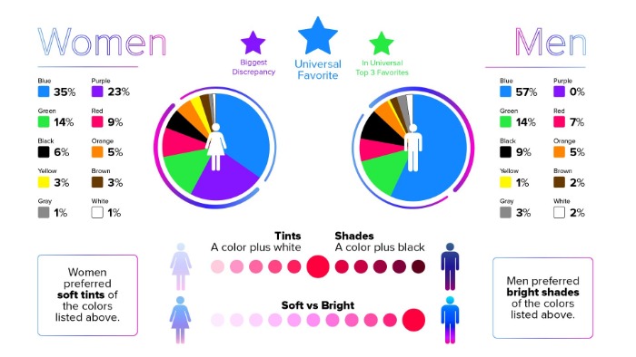
A case study shows much of this holds true, at least for women, with blues, greens, and lavender colors remaining popular.
For colors that can improve conversions, regardless of sex, then reds, greens, blues, purple, black, and orange seem standard.
Also, keep in mind that gender isn’t considered as binary as it once was, so relying on a color that appeals to men versus women might not be as effective as you might think.
Certain colors can also suggest specific qualities. Let’s look at a selection of them.
Use Blue to Cultivate Trust
Blue is heavily associated with trust, which may be why many financial institutions often choose it. PayPal, Capital One, Visa, and Bank of America are just a few of the financial companies using blue in their color schemes.
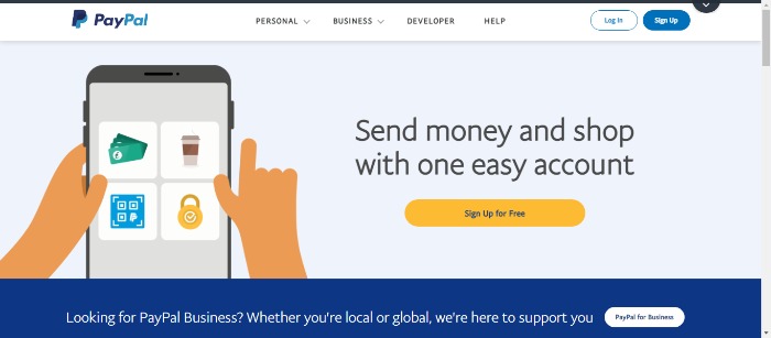
Although various shades of blue can suggest different things, it also symbolizes:
- security
- loyalty
- responsibility
Everything most of us would look for from a financial institution. However, while blue is pretty much an all-around great color, it may not work well for food packaging. Research indicates blue is a natural appetite suppressant, but, again, not everyone agrees.
Yellow Equals Caution
Yellow can signal caution. Warning signs, traffic signals, and wet floor signs all use yellow. That said, it’s not all bad. Yellow is a color we connect with warmth, positivity, and happiness.
Yellow inspires creativity, joy, fun, and confidence, and the shade of yellow used can speak volumes, too. For example, a bright yellow incites attention and excitement, and golden yellow is correlated to curiosity.
Green for Environmental and Outdoor Products
Green is associated with the outdoors, nature, and the environment: we see a product in green packaging, and we automatically think of it as healthy or eco-friendly. Additionally, green can inspire creativity, innovation, and balance.
If your website’s focus has anything to do with nature, the environment, organic, or outdoors, you might want to select green colors.
Orange Is Positive
Orange is a positive color linked to happiness, success, and determination. In addition, it gives a sense of warmth while appearing less aggressive than red.
Like other warm colors, orange can feel energetic, and it may gain shoppers’ attention, leading to impulse purchases.
For example, Amazon.com uses orange to trigger action. The color suggests urgency, which makes the message more noticeable and actionable.
The color works best with other warm shades, but remember to use it sparingly. Try it on conversion elements of your site, so it stands apart.
Black Means Elegance and Luxury
Although we sometimes see black in a negative light, it’s a frequent choice for luxury retailers.
Aside from the mystery associated with black, the color suggests elegance, luxury, and sophistication.
In color psychology, black represents authority, power, and prestige. This would explain why Prada, Rolls Royce, and Chanel use it in their logos.
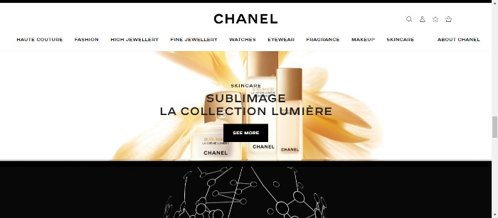
However, brands like Chanel are careful not to let black dominate on their websites, although it does play a part in their overall color schemes.
Use Bright Primary Colors for Your CTA
Multiple studies have looked at the best colors for CTAs, and as you may expect, many of them disagree with each other.
However, brands often favor bright colors like reds, blues, and greens. Then there’s Amazon, who famously uses its orange CTAs.
Nevertheless, the most important thing about your CTA isn’t necessarily the color itself: you need to look at the contrast, your audience, and your branding.
What About White in Color Psychology?
White space is paramount to good website design. It reduces clutter and gives a clean appearance, and there’s plenty of ways you can use it.
For example:
- in simple, minimalistic designs
- for typography and adding contrast
- with a splash of color for that extra “pop”
If you don’t like pure whites, consider adding some warmth by using off-whites like ivory.
Color Psychology Best Practices
Updating your colors doesn’t mean starting from scratch. You may not be in a position to rewrite your style guide and pick your website color palette or font colors on the email template, but you still have some options.
Here are some solid takeaways you can use as you implement color psychology into your marketing and increase conversions:
If the Colors Don’t Work, Suggest Changes
If you’re working with designers or decision-makers, speak up if you feel the overall design scheme won’t work. For example, if you’re selling a high-class designer product, you won’t want to pair a sophisticated color with an amateur-looking logo.
Explain why some color combinations won’t work and how the right mix can positively influence conversions.
Use Psychologically-Appropriate Colors to Complement the Existing Color Scheme
Sure, you need to adapt to the color scheme. Just make sure you use colors that blend well with the current choices, the brand, and the feelings you’re trying to evoke. For instance, if you use blue, combine it with a sunny yellow for a pop-up for a positive feel.
Test Several Colors
To improve conversions, try different colors until you find the one that works for your brand. For example, HubSpot found red outperformed green CTA buttons, but that doesn’t mean it will be the same for you. Whatever color you go with, just make sure the color “pops” for greater visibility and higher conversions.
Don’t Forget; Color Is a Conversion Issue
Yes, you’ll want input from a designer, but don’t let them dictate your website colors. You’re not just looking for something that looks good: you want a color scheme that converts. Therefore, you should be heavily involved in the color selection of your landing pages to improve your conversions.
Avoid Color Overload
Too many colors can create a sense of confusion, so don’t go overboard: reign in your color scheme with white.
Conclusion
It’s easy to overlook the potential of color psychology. However, the colors you choose for your website, branding, and marketing may be more powerful than you realize.
When choosing your color scheme, take an active part and don’t leave the decision down to a designer. Only you know what you want your website to say and what you want your visitors to do when they visit your website.
If you aim to increase conversions, for instance, then you may want to use specific colors, like reds, blues, and orange.
However, remember that the psychology of color doesn’t give guaranteed results, and the same colors won’t have the same impact on everyone.
Do you take color psychology into consideration in your website design and marketing? Tell us how you use it below.
from Blog – Neil Patel https://ift.tt/38gVq9V
via IFTTT
No comments:
Post a Comment