There was a time when pop-up ads were nothing more than spam and junk. Fortunately, marketers and business owners improved their methods after realizing users will no longer respond to poorly thought-out pop-up ads.
When done correctly, pop-ups can convert at three percent or higher!
That’s because today’s pop-ups are highly targeted, contextual, well-timed, and strategized. Your goal should be to meet those four criteria with your ads. If you’re having a hard time, this guide should help.
What Is a Pop-Up Ad?
A pop-up ad is a window that displays over the page you’re looking at. The goal of a pop-up ad is to generate an action from the visitor. The desired action could be to make a purchase, subscribe to a newsletter, enroll in a course, attend a webinar, or any other action you want users to take on your website.
Sometimes they show when you first land on a page and other times when you’re about to leave a page.
In some cases, pop-ups can continuously display when certain events are triggered on the site.
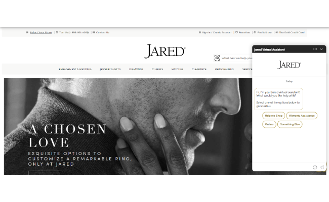
You may have even seen pop-ups on websites asking you to try out a live chat if you’re having difficulty finding what you want on the site.
These pop-ups can be helpful or not depending on the user experience they deliver. If you’re looking to improve how pop-ups perform on your site, make sure sure the value they provide connects with what the user is looking for or where they are on your site.
Why You Should Use Pop-Up Ads
Using pop-ups can have lasting effects on your conversions without increasing your bounce rate or turning too many people away. There are a few primary reasons why you should be using pop-up ads:
You’re Offering Instant Value
The magic word is value.
Since value is the ultimate separator between a successful ad and a failed one, it means you need to understand your audience and what they want. This is where context comes into play. Ads that are relevant convert at over 40 percent.
The main point of a pop-up ad is to make visitors feel like they’re getting something others aren’t. If you’re offering serious value in your pop-ups, then the person is more likely to take the desired action.
You’re Choosing Not to Be Ignored
In the past, sidebars were only converting at around 0.3 percent, and it’s only gotten worse over time.
It’s easy to ignore a sidebar or a banner at the top of the screen, but it’s impossible to ignore something that appears in the middle of the page.
We’re so used to seeing ads everywhere that it’s become nearly impossible to get someone’s attention unless you give them no other choice. A properly placed and well-timed pop-up will do that.
You’re Engaging
Believe it or not, by not interrupting your visitors you can hurt your conversion rate.
Sometimes the endless scroll can leave users feeling like they’re not getting what they expected and make them want to leave. A scroll pop-up at the right spot down the page can re-engage the user, helping them stay on track with their main purpose for visiting your site.
It’s also believed that pop-ups with elements such as pictures, videos, or games convert higher than those without. According to some original research from Sleeknote, pop-ups with images convert nearly 2x more than ones without them.
Engaging your audience at the right time can keep them on the page longer and increase their conversion chances.
You’re Creating Urgency
Pop-ups with countdown timers convert around eight percent better than those without.
Marketers get site visitors to convert sooner by creating FOMO or a sense of urgency. This is done through the use of countdown timers, one-time offers, or time bars.
When you do this, it makes the user think twice about clicking away from the pop-up because they are not sure if it will come back or not.
You’re Timing Your Pitch Just Right
A pop-up can have a positive effect when timed perfectly. Most marketers believe users will instantly click away from the pop-up and continue with what they’re doing.
While that’s the case most of the time, it doesn’t happen all of the time.
Many studies show that waiting at least five seconds before displaying the ad is the best policy. I say take it a step further and figure out how long people spend on your site before they bounce. Right around that time is when you’d want to display the pop-up to re-engage them and keep them on the site longer.
Pop-Up Ad Strategies That Work
Let’s talk about the actionable strategies you can implement in your business to increase your conversions.
1. Exit-Intent Pop-Ups
Using exit-intent pop-ups correctly can increase your conversions right away.
One case study found that simply showing an exit-intent pop-up to over 20,000 people converted close to 5 percent of them. So you should really try them out if you haven’t yet.
An exit-intent ad displays right when the user is about to leave the page. This can happen on desktop when the cursor moves from the page or on mobile when the user removes their finger from the screen.
Think of these actions as your last chance to get someone to stay when they may never come back.
One of the best strategies to use as a person is leaving is to ask for their email. Just imagine the lasting effects of this small change on your site can have in the long run.
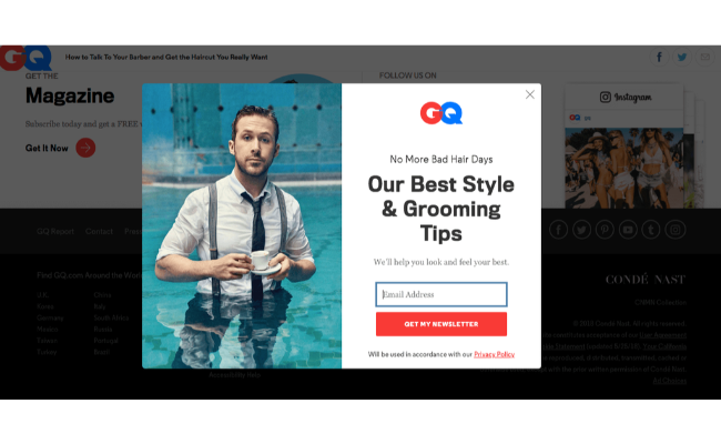
The most important thing to remember is to segment your audience, so the context of the pop-up is spot-on. In the case of GQ, they made their exit-intent pop-up lighthearted, and they targeted a specific audience.
It doesn’t make you feel like you’re signing your life away or committing to endless emails, plus the context makes sense for a young man.
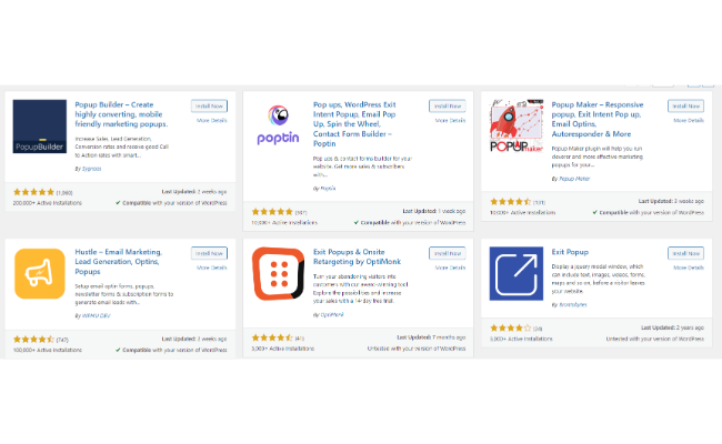
Most site builders like WordPress, Shopify, Squarespace, and Ghost will all have ways for you to plug and play with an exit-intent ad. Simply download the plug-in and fill out the fields with all the details.
2. One Time or Limited Time Offers
We all know that FOMO sells. That could be why seasonal offers convert at 11.88 percent.
There’s urgency tied to the pop-up. The user won’t feel like they can come back next week and get the same offer.
The conversion rate can be even higher if you’re adding promo codes, coupons, or anything along those lines to catch their attention.
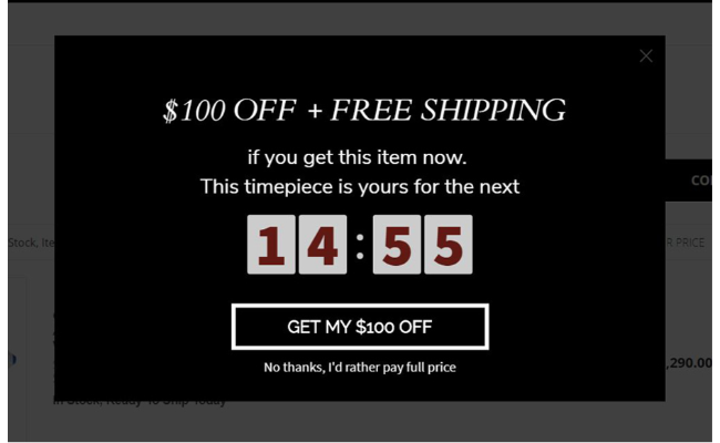
Take this example from SwissWatchExpo.com. The pop-up does a lot of things right. It creates urgency by telling you to act now, and it even uses the 100 dollars off in the CTA button.
Plus, you even get free shipping if you act now. If you do nothing, you may have to pay the total price and shipping. It almost seems like a no-brainer because the value is stacked, and the offer seems far too good to pass up.
To implement one-time or limited-time offers on your site, you need to think about your audience first. Consider what types of offers would make them act immediately.
If you’re selling physical products, it could be something as simple as free shipping.
If you’re selling digital products, you could offer a free 30-minute call in exchange for a three-month commitment to a course or something along those lines. The best way to figure out what your audience wants the most is by looking at the best-selling products or services on your site.
Find a way to bake those things into a limited-time offer, and you’ve got yourself a recipe for a successful pop-up.
3. Shopping Cart Abandonment Pop-Up
In the e-commerce world, shopping cart abandonment ads are king.
Unfortunately, according to Statista, nearly 70 percent of people will leave your site without completing their purchase.
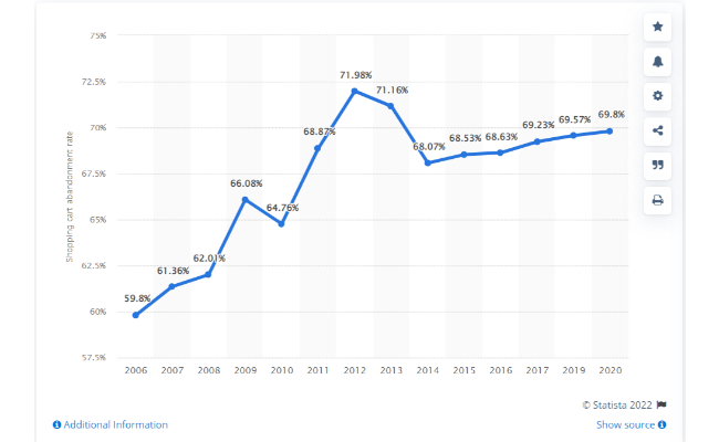
One method many marketers use is retargeting ads or cart abandonment emails. What if you could get the user to convert before they even leave the site?
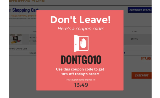
The example above from Lamin-X does everything right. Their pop-up immediately catches your attention, offers a coupon code, and creates urgency with a countdown timer.
Doing these things makes the user think twice because now they can save an extra 10 percent. If they wanted to wait until tomorrow, the deal wouldn’t be there anymore.
Not surprisingly, these types of pop-ups convert up to 17 percent higher. I also see it as an excellent opportunity to find return customers because they will remember it as a positive experience since they received a good deal.
Setting up a cart abandonment pop-up is the same as an exit-intent one. They’ll display right when the user is about to leave their cart and click away from the site. The promo code or discount will be baked into the ad, and applying it will reduce the overall price of the sale.
4. Offer Related Products or Services
I want to break this down into two separate topics because products and services are two completely different scenarios.
First, let’s talk about pop-ups for digital or physical products.
These pop-up ads will display like any other, and you can set up a variety of different actions that may trigger them.
Don’t assume your ads have to always give a discount or something for free.
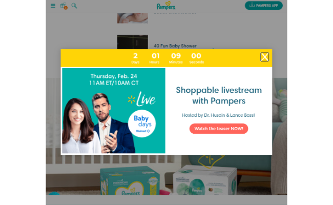
The example above from Pampers.com shows they aren’t giving anything away, they’re inviting you to check out a live-stream hosted by two popular names. What is the draw for someone to want to watch this?
In this case, if you’re shopping on the Pampers website, you’re the parent of a young child and might be more receptive to parenting advice from some experts.
What about those who sell digital products such as courses, guides, and services? You could do as WordStream does.
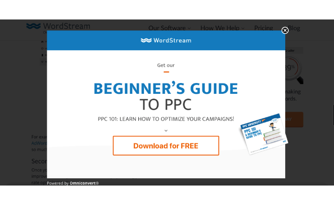
You need a lead magnet that is relevant to your audience.
In this example, the user is reading an article about PPC. What do they offer? They offer a guide on PPC that you can download for free with an email subscription. The site gets the email, and the user receives the guide. Seems like a fair trade.
A case study performed by getsitecontrol.com found that these types of pop-up ads convert at over two percent. If you have a popular site with decent traffic, you can expect to see approximately two email subscribers for every 100 visitors.
As I’ve been preaching throughout this post, context and relevance are key. As long as you’re providing something valuable to the user, they’re likely to convert. If they’re reading some content you have on SEO, offer them an in-depth SEO eBook.
If they’re shopping for scuba gear on your e-commerce site, consider offering a guide on the best scuba destinations in the world. Think of what your audience wants and include it into an offer they can’t refuse.
5. Gamify Your Pop-Ups
Gamification in marketing becomes more popular by the day. It’s a way to engage your audience while giving them something that excites them.
You could do this with a “spin the wheel” ad, a digital scratch-off, or even a quiz. In one case study we looked at, wheel pop-up ads engaged between 5-20 percent of people who landed on the site.
Using these ads can yield a variety of results. You can ask users to enter their email and name in exchange for a spin, you can require them to download something, or you can even suggest they stop into your brick-and-mortar in situations where local marketing comes into play.
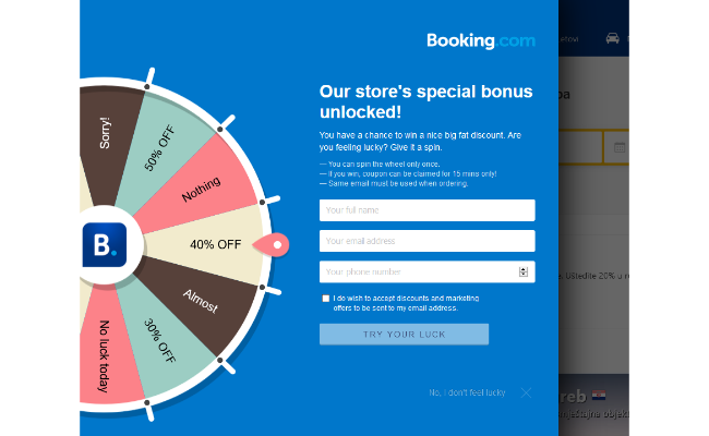
Unlike all the other pop-up advertising, this one can generate the lowest quality subscribers because you’ll get a lot of people inputting burner emails just so they can spin the wheel or take the quiz.
This issue can impact your email deliverability over time and have an overall negative impact on your business. Be sure to clean out your email list more frequently if using this strategy.
To gamify your pop-ups, think about your audience demographics. Are you selling products to an older generation like boomers? They might not be interested in playing games on your site, so you may benefit more from a different strategy.
Once you’ve determined your ideal demographic, you need to figure out what you’ll offer on the wheel. Don’t go crazy and give away too much, but you need to make the options enticing enough to make the user want to give you their information.
Examples of Great Pop-Up Ad Usage
Remember your pop-ups don’t have to be super complicated. You don’t need a ridiculous offer. All you need to do is time your pop-up properly and display the right offer to the right audience.
Take ZooShoo, for example.
This women’s retailer was getting a lot of traffic on their site but had very little to show for it. Simply by offering a 10 percent discount to anyone who signed up for the email list, they were able to increase their revenue by 7.35 percent and add 5,000 subscribers.
Keep in mind that you don’t always need to offer a discount or give away promo codes. You can offer your time and services in exchange for a commitment from the user. That’s what Will Nicholls from Nature TTL did.
This photographer used a welcome gate ad that displays as soon as you land on the site offering a free eBook to help photographers learn how to take better nature photos.
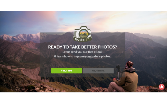
The results were a 4.54 percent boost in conversions and a 400 percent increase in weekly subscribers. It’s such a simple and affordable change to make in your business that can yield massive results over the long term.
This is once again an example of not overcomplicating things. Will understands his audience, why they’re on his site, and what they want to learn. As a result, he created the perfect offer. Not to mention the fact that the opt-in looks terrific.
If you’re looking for something with a bit more flair and excitement, gamification is the way to go.
Loot Crate implemented a prize wheel on their site and, like many other e-commerce store owners, experienced higher conversion rates.
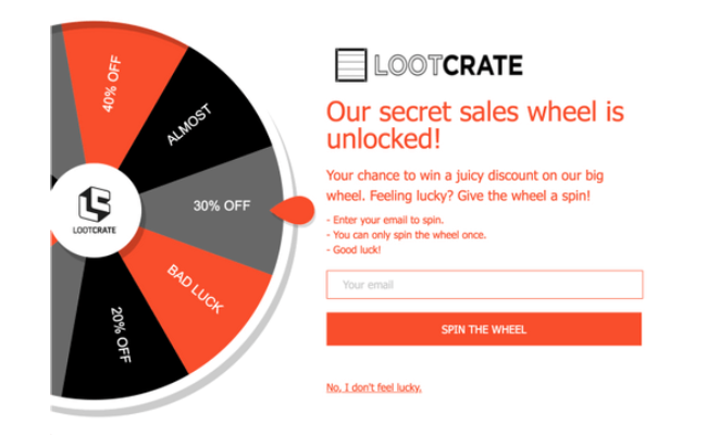
If you decide to take this approach, just make sure that whatever you promise on the wheel won’t have a negative impact on your business’ bottom line. You should also consider if the wheel is really necessary for your business model and whether it can provide real benefits. In many cases it won’t make sense which is perfectly find.
You could end up giving away a lot without getting much in return besides bad email addresses that don’t deliver.
That said, Loot Crate does a nice job of not offering something on every spin and ensuring they only allow the user to spin one time per email.
Pop-Up Ad Best Practices
There are some crucial guidelines you’ll want to follow when putting together your pop-up ads. Here are the most important ones.
- Context – Would you ask a first-time site visitor to subscribe to your newsletter as soon as they land on the site? Of course not. They don’t even know what you’re offering at that point so you need to deliver the suitable pop-ups to the right person.
- Timing – The lowest converting ads display within 0-4 seconds after a visitor arrives on a site. Don’t you hate it when you walk into a store, and a salesperson rushes right over to you to ask if you need help with anything? Give the person a chance to look through what you have before asking them if they want something.
- Value – You need to add value to whatever you already have going on. If you’re selling shoes and someone looked at them on your site, you offer a discount on those shoes to entice them back to your site. The best way to add value is to find out why people are leaving before they complete their purchase? Maybe your checkout process is too long, or you’re not transparent about pricing.
Pop-Up Ad Frequently Asked Questions
Do pop-up ads work?
Pop-up ads convert at around three percent or higher depending on what type of ad you’re using and your industry. We can’t use the old tactics and expect today’s internet browsers to react positively.
How much does it cost to add pop-ups to my website?
In many cases, it shouldn’t cost anything. If you need some help, we have a community of marketing experts who can help you put together the best pop-up ad so you can get the results you want.
What size should a pop-up be?
While there isn’t a “right or wrong” size for your pop-up, choosing something that doesn’t cover the whole screen and is perfectly visible will bring better results. It’s recommended that a desktop pop-up is 500×400 and a mobile pop-up is 375×660.
What’s the difference between pop-up and pop-under ads?
Pop-under ads open a new window that displays behind the current window you’re using. These do not interrupt the user, thus creating a better experience. The problem is, these have a nasty reputation for being spammy and linked to dangerous websites.
Conclusion: Pop-Up Ads
I hope these pop-up ads examples and tips will help you convert more users and provide a better experience on your website as a whole. When done correctly, pop-ups can help you maximize the traffic you’re already getting with little impact.
The most important thing to consider is the context, timing, and value offered in your ad. The more those connect and resonate with your audience, the better the results will be.
Whether you’re in e-commerce marketing, growing a blog, or offering local services, you can benefit from proper on-site pop-up usage.
What pop-up ad do you believe is the most effective?
from Neil Patel's Digital Marketing Blog https://ift.tt/OEFlpew
via IFTTT
No comments:
Post a Comment