
A website’s architecture refers to how its information and pages are structured and linked. It’s an essential part of on-page SEO and user experience but routinely overlooked—in fact, according to a study, 12 percent of a typical website’s pages have too many internal links
—and that’s not a good thing.If your website resembles a random collection of pages, both humans and search engines will have a hard time finding information and working out what your site is about. That means a high bounce rate and poor rankings.
Luckily, there are many ways to improve your website architecture. In this guide, I’ll share ten strategies you can implement today, regardless of how big your site is or how long it’s been live.
Why Does Website Architecture Matter?
Website architecture is important to both human visitors and search engines.
By logically organizing your content using features like sitemaps and breadcrumbs, you make it easy for search engine bots to navigate your site, understand what it’s about, and index all your content.
Strong internal linking practices—another feature of excellent website architecture—will also distribute page authority and link juice more equitably. All that to say, good website architecture will give you more chances to rank and help each page rank higher.
Good website architecture also makes it easy for visitors to find what they need for your site — and that can impact conversions. According to Forrester, better UX can improve conversion rates by 400 percent.
Even if you have the best content in the world, poor architecture practices will send users running for the hills and into the hands of your competitors. A high bounce rate will follow, which can impact search ranking.
Ultimately, the health and profitability of your website hinge on the quality of your website’s architecture. The better your architecture and the easier it is for people to navigate, the higher it will rank and the more visitors it will convert.
1. Use Simple Navigational Structure
According to the results of a recent survey, bad website navigation is one of the top three reasons a user leaves a website.
Have you ever been overwhelmed by the number of pages on a website’s navigation bar? Large apparel brands are notorious for this, and it can make it a real headache to find specific pages.
That’s the exact opposite of what a good navigation bar should be.
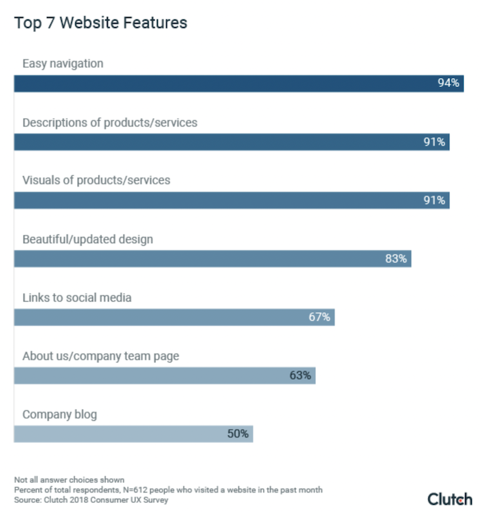
Having a clean and simple navigation bar is essential. In fact, the vast majority of people (94 percent) believe easy navigation is the most useful website feature.
Your navigation bar should make it easy for users to find your most important pages quickly. They should also be able to use it to see your site’s structure at a glance. That could be the services you offer, the product ranges you sell, or the topics you cover on your blog.
When creating a navigation bar, the trick is to avoid making your users think too hard. They shouldn’t have to waste time searching a massive menu bar, nor should they have to guess where you’ve hidden the page they want.
Here’s a great example from Apple:

Each product category has its own heading, and there’s a link for just about every service you could want. Whether you want to make a purchase or find out more about Apple’s accessories, you don’t have to look too far.
Want to improve your own navigation bar? Here’s what I recommend:
- Keep your top-level menu items to a minimum. Those top-level items should be your most important pages. For instance, that could be a list of your services, your about page, and your blog. It definitely shouldn’t be a link to your site’s privacy policy.
- Don’t go crazy with sub-categories. Dropdown menus make it easier for users to find the specific page they want, especially if you’re an e-commerce store. However, massive ones can be hard to navigate.
- Make sure each sub-category directly relates to its parent category. For example, every sub-page under your “Blog” heading should be a category on your blog. When clicked, those pages should only show blog posts—not product pages or whitepapers or anything else.
- Include a link to your homepage in your navigation bar. This will make it easy for users to start over. This can be written out as “HOME,” but it’s common practice to embed the link into your logo.
2. Optimize Your URL Structure
Your URL structure is one of the best ways to ensure your site stays organized. URLs show your site’s hierarchy to humans and search bots and help them see where each page belongs and how they relate.
Your URL structure should be as clean and straightforward as possible. For example, let’s say you’re an e-commerce store selling pens. The URL for your homepage might be:
mypenstore.com
You could then group each product range under a category page like:
mypenstore.com/ballpoints
Each pen would have a URL that relates to its category page:
mypenstore.com/ballpoints/parker-red
By organizing your URLs like this, it’s easy to see what a page is about and how it relates to other pages on your site.
This is similar to what Apple does. The URL for its iPhone category page is simple:

And the URL for the iPhone 13 page is:

I recommend the following rules when creating URLs:
- Keep your URLs under 130 characters (use this URL length checker).
- Separate words with hyphens.
- Avoid using numbers where possible.
- Make them descriptive.
- Try to include keywords, but don’t stuff.
- Make them logical.
- Keep category names consistent across URLs and navigation menus.
Google also provides guidance on URLs.
A good CMS will create user-friendly URLs by default based on your page title and website structure. In WordPress, this will usually look like:
yoursite.com/page-title
If that’s not to your liking, you can change your permalink structure by going to Setting > Permalinks.
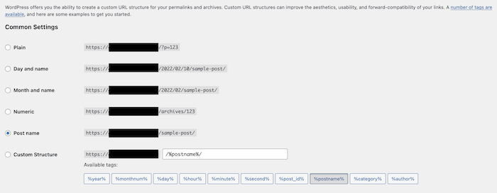
It’s important to note that generally, the simpler the URL, the better. Backlinko found shorter URLs perform slightly better than longer ones.
3. Reduce Number of Clicks to Top Pages
It doesn’t matter how many pages your site has; visitors should be able to go from your homepage to the most important pages on your site in just a handful of clicks.
Keep in mind 47 percent of users leave a website after viewing just one page. To keep users on your site, you not only need to create engaging content—you also need to make it easy for visitors to click between important pages on your site.
A common rule of thumb is the three-click rule. SEOs Eric Enge, Stephan Spencer, and Jessie Stricchiola also recommend four clicks in their book, The Art of SEO. “For nearly every site with fewer than 10,000 pages, all content should be accessible through a maximum of four clicks from the home page and/on sitemap page.”
This gives your website a flat site structure rather than a deep site structure. A flat site structure means users can visit any page on your site in just a few clicks. A deep site structure means it can take five or more clicks to reach certain pages.
Here’s a visual comparison of flat and deep site structures, courtesy of the Nielsen Norman Group.

A flat site structure is much better for users and SEO. To create a flat site structure, you’ll need great internal linking practices. That means link authority flows from pages that get a lot of backlinks (like your homepage) to pages that don’t (like your product pages). It also means search bots can quickly and easily navigate your site and index all of your pages.
Top-level navigation is key to making this a reality. Include each of your site’s major categories, plus sub-category pages via dropdown menus.
Also important is a great internal linking structure. We’ll go into more detail on this below, but the more each page links to other pages, the easier it is for users to navigate and the more freely link juice can pass.
Be careful of going too far and making every page accessible from your homepage, however. A completely flat architecture means a total lack of hierarchy, way too many links on your homepage, and an even worse user experience.
You also don’t have to take the three-click rule as gospel. Page Laubheimer, a Senior User Experience Specialist at Nielsen Norman Group, points out there isn’t any published data that supports the three-click rule. “In fact, a study by Joshua Porter has debunked it; the study showed that user dropoff does not increase when the task involves more than 3 clicks, nor does satisfaction decrease,” he says.
4. Use Topic Clusters
HubSpot recently did a topic cluster experiment for a group of topics they pre-selected. Here are the results:
- domain authority went from 40 to 60
- weekly organic sessions grew 13 percent week over week
- clicks from SERPs for one target keyword grew by 1500 percent
If you want users or search bots to understand your website better, it helps to group together similar pages. That’s the idea behind topic clusters.
Also known as topic silos or a hub and spoke strategy, this concept uses parent pages and child pages to group related pages and demonstrate your site’s topical relevance.
Here’s how it works: A parent page (the pillar) covers the topic in broad detail, providing all the top-level information a user needs. That page links to multiple other pages (the clusters) that cover specific parts of the topic in more detail. Each of those pages links to each other, forming a connected cluster.
You can go even further by combining the topic cluster model with content silos. Content silos offer even more hierarchical clarity using a ladder effect. The main pillar page sits at the top of the ladder with other pages below it. The further down the ladder you go, the less important (and usually more niche) these pages are.
Here’s a diagram from Niche Pursuits to demonstrate what I mean:
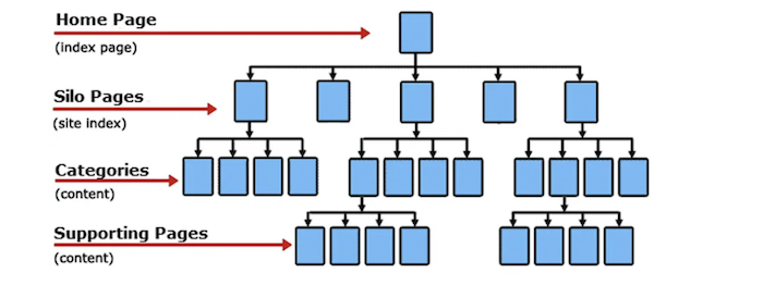
Creating topic clusters and content silos is great for visitors who want to learn about a particular subject. They can improve your site’s rankings, too. Creating topic clusters filled with detailed articles signals your authority to search engines. With all these pages clustered together, it’s easy for Google to assess your authority on a topic and rank you accordingly. This is called topical relevance.
Topic clusters also help you rank for more keywords. Pillar pages are great at acquiring links and cover broad topics in such a way that makes them likely to rank for high-volume keywords. By linking out to cluster pages, pillar pages share page rank and link juice to help them rank for the specific, long-tail keywords they target.
Using topic clusters will help you create what Google’s John Mueller calls the best website structure—a pyramid structure:
“A pyramid structure helps us better understand the context of individual pages within the site. So in particular, if we know this category is associated with these other subcategories, then that’s a clear connection that we have between those parts. That helps us better understand how they are connected and how they work together.”
Creating your own topic clusters is pretty straightforward:
- Start by finding pages on your site that talk about the same topic.
- Create a pillar page that links all of the pages together and discusses the topic at a high level.
- Add links on your pillar page to each of the more specific pages to form a cluster.
- Go through each cluster page one by one and find natural ways to link to each of the other cluster pages and the pillar page.
5. Use Category Pages
Category pages are similar to pillar pages but without the depth of content that makes pillar pages such good link targets. They’re most commonly found on e-commerce websites and blogs. They usually just contain links to products or blog posts with little to no additional copy.
Category pages help keep your site’s architecture organized in the long run, no matter how large your site gets. With category pages, you don’t have to worry too much about where new pages slot into your existing structure. Simply choose the most relevant category, and it’s done for you.
Like topic clusters, category pages make it easy for humans and search engines to understand the layout of your site. They are also a great ranking opportunity, especially for e-commerce stores. JumpFly and seoClarity found that category pages outperformed product pages, delivering more rankings and traffic.
You can add category pages even if you don’t run an e-commerce store. Service providers may be able to categorize their services. For instance, a digital marketing agency could create categories for SEO, PPC, and email marketing. Specific services like on-page optimization, link building, and competitor research would then be listed under SEO.
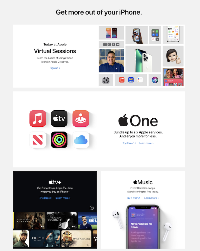
Let’s head back to Apple’s site for an example of category pages done right. Each product category is listed in the navigation bar, as we’ve already discussed. Click on one, the iPhone, say, and you instantly get links to each specific product.

Below, Apple spells out the features and benefits of its products and helps you decide which iPhone is best.

Carry on further down, and Apple links off to other services related to the iPhone. As a result, Apple’s category page acts just like a pillar page.
6. Create a Site Map
A sitemap is a list of all the crawlable pages on your site. It’s an essential part of your website’s architecture because it displays your site structure in a format both search engines and humans can read and crawl.
There are two types of sitemaps you need to care about: HTML and XML.
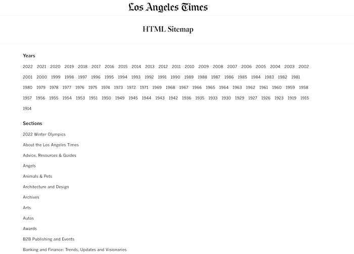
HTML sitemaps are designed for both humans and search bots. They display your site’s structure, topic clusters, and pages. You don’t have to include every page on your sitemap—only the most important ones.
Take the Los Angeles Times website, for example. It doesn’t list every article on its sitemap; it only links to annual archives and its top categories.
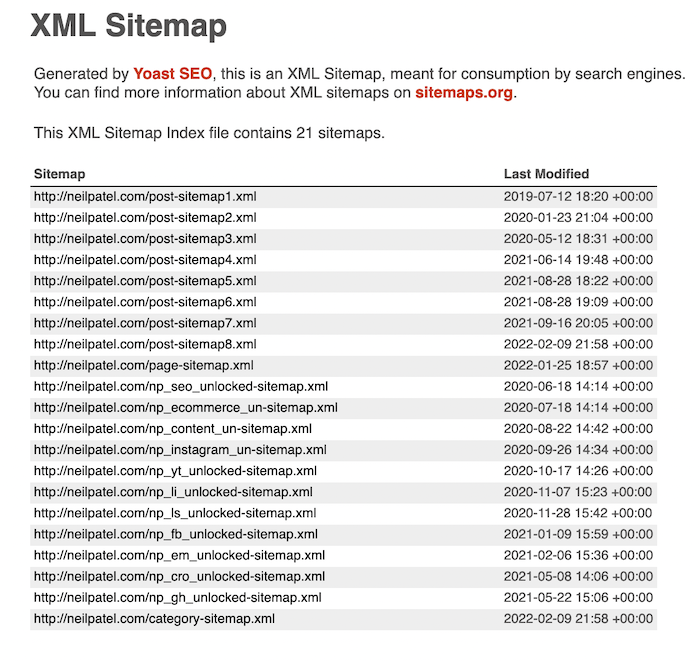
An XML sitemap is used by Google’s crawlers to understand the organizational structure of your website better and get a sense of which pages are most important. Google recommends having an XML sitemap to help its bots crawl your site and even shows you how to create one.
The text-based format of an XML sitemap will be confusing for humans, but search bots will understand it perfectly. Here’s what the sitemap for this website looks like:
Creating a sitemap is easy. There are dozens of tools you can use to create both HTML and XML sitemaps. Here are three I recommend:
7. Create an Internal Linking Strategy
Internal linking is the practice of connecting your website’s pages together, which is a fundamental part of your site’s architecture. By linking pages together, you add context and relevance, let users and search bots move freely around your site, and allow link juice to pass between pages.
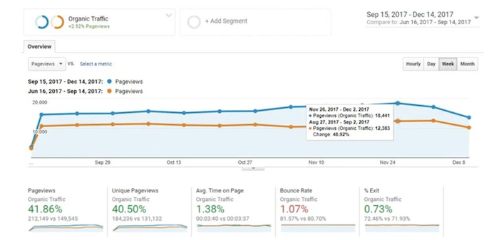
Check out this case study by NinjaOutreach, for example. They managed to increase organic traffic by 40 percent through an internal linking campaign.
It’s why it’s important to link to category pages in your navigation bar. It’s also why the parent pages of topic clusters should link to child pages and why child pages should link between each other.
You don’t need to stop there, though. Each page of your website should link to at least a couple of other pages in the copy. That’s what I mean when I talk about creating an internal linking structure.
Look at this article, for example. I link to multiple blog posts throughout the article where appropriate. As a result, readers are able to nip off to learn about certain topics in more detail in order to better understand the content.
You’ll need to pay attention to the anchor text you use, as well as where the link points. The anchor text sends an important signal to readers and search engines about what the target page is about. Where possible, use a descriptive, keyword-rich anchor text to squeeze as much value out of each internal link as possible.
8. Add a Site Search
Search functionality is essential if you want to make your site as easy to navigate as possible. This strategy is primarily aimed at improving the user experience rather than your SEO, but boy, is it effective.
When offered, site search is used by almost one-third of users. It also improves your conversion rates. Visitors are 1.8 times more likely to convert when using site search.
Adding site search to your website isn’t as hard as you think. All major search engines have their own technology that lets you embed a search engine into your site. They’re relatively easy to implement, too. Simply follow these step-by-step instructions to add Google search functionality to your site, for instance. With site search implemented, users will find it a lot easier to navigate your site.
9. Use Breadcrumbs
Forget about Hansel and Gretel for a moment. Breadcrumbs, as they relate to your website, are the links at the top of a page that indicates that page’s place in your site’s hierarchy.
Using breadcrumbs can help your website in numerous ways. In a recent case, a company called Equitable Mediation Services was able to crack the top 10 results in the Google SERPs after just a few months by using breadcrumbs and other local SEO strategies.
Breadcrumbs actually a form of internal linking and an equally good way to improve your website’s architecture. In addition to demonstrating your site’s hierarchy, they also show a user exactly where they are within your site structure and make it easy for them to navigate back to a previous page.
Here’s an example of breadcrumbs in action on Everlane’s site.

Not every site needs breadcrumbs, but I’d recommend using them where possible. You’ll see them at the top of this page, for instance, and on the vast majority of e-commerce stores.
You can add breadcrumbs to your WordPress site using your preferred SEO too. Yoast, AIOSEO, and Rank Math all provide tutorials to get you started.
10. Use Canonical Tags
Canonical tags might sound scary to anyone unfamiliar with advanced on-page SEO, but they shouldn’t be. When you have multiple versions of the same page on your site, canonical tags are simply a way of letting Google and other search engines know which one matters most.
Canonical tags significantly reduce the chances of duplicate content and stop search bots from wasting crawl time on similar pages that don’t need to be indexed. They’re a fantastic way to improve your site architecture, as a result. Without them, the indexed version of your site would be riddled with dozens of the same page, which could see you hit with a duplicate content penalty.
Canonical tags are particularly important for e-commerce sites where duplicate pages are incredibly common thanks to category filters. For instance, the same product could be found under multiple URLs if users can search by size, color, brand, or any other characteristics.
Because you don’t want Google to index all of these pages and throw up a duplicate content issue, use a canonical tag to clarify which page should be ranked.
Duplicate content issues aren’t just thrown up by e-commerce pages, however. You may need to use canonical tags if you have both a WWW and non-WWW version of your site.
Adding a canonical tag to duplicate pages is easy. Just add a rel=canonical tag into the <head> section of each duplicate page. It should look something like this:
<link rel=“canonical” href=“https://neilpatel.com/main-page” />
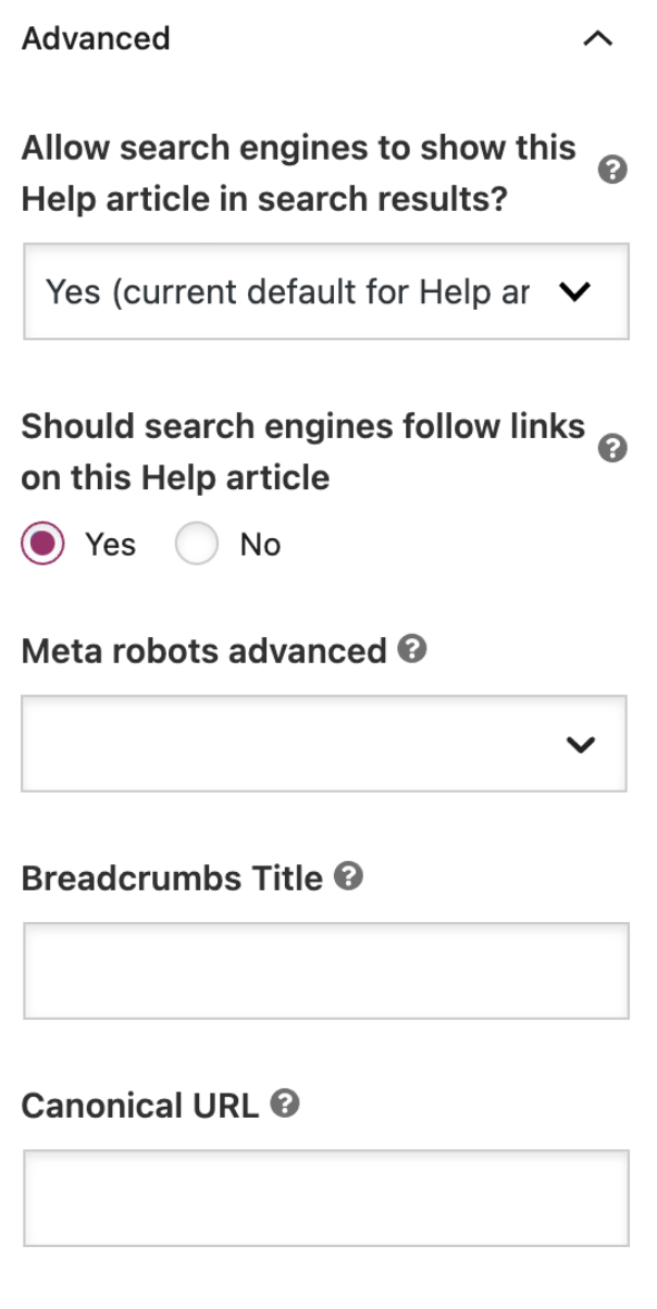
OK, doing that for every page can become tedious if you have hundreds or thousands of duplicates. Luckily, you can use the Yoast SEO tool for WordPress to automatically add canonical URLs. Just scroll down to the Advanced section of the meta box and choose the URL you want the tag to point to.
Website Architecture Frequently Asked Questions
Is website architecture important for SEO?
Yes, website architecture is an essential part of on-page SEO. Good architecture makes it easier for Google to crawl your site and index your pages.
What is the difference between flat and deep site architecture?
A flat architecture means the most important pages of your site are accessible in a few clicks. A deep architecture means it can take five to ten clicks to get to the deepest pages on your site.
What is good site architecture?
A good site architecture means having a well-structured website that is easy to navigate. It uses simple URLs, breadcrumbs, category pages, sitemaps, and internal linking.
How do I create a website architecture?
Use features like simple URLs, a sitemap, internal links, category pages, canonical tags, and breadcrumbs to create good site architecture.
How do I structure my website contents?
Your website’s content should be structured in a clean, organized manner. Use simple URLs and topic clusters to signify hierarchy and category pages to group similar content together.
Conclusion: Website Architecture
How you structure your website has a huge bearing on user experience and SEO. All things being equal, improve your site architecture and you’ll boost your conversion rate and increase your rankings.
There are many ways to improve your website architecture. Even if you think you’ve nailed it when you built your site, there’s probably still room to improve. Structuring URLs correctly and adding topic clusters are great places to start.
The most important rule of all, however, is to keep it simple. The simpler you can keep your website architecture, the easier it will be to manage as your site grows.
How are you going to improve your website architecture?
from Neil Patel's Digital Marketing Blog https://ift.tt/Pie8hMq
via IFTTT
No comments:
Post a Comment