
As a website owner, do you feel as if the line between a good user experience and optimal search engine optimization (SEO) is a tightrope?
It’s not uncommon to feel like you have to prioritize one over the other. When it comes to minimalist website design, that feeling becomes more pronounced. After all, search engine optimization requires ample content for optimization. Doesn’t it?
This article will explore the relationship between minimalist website design and organic keyword rankings. We’ll look at six websites, including one non-minimalist one, to answer the burning question: Do minimalist website designs help or hurt your SEO?
Why Are Minimalist Website Designs Getting So Popular?
A minimalist website is one that uses content sparingly. This may include words, but it can also include images, graphics, and videos.
So why are minimalist website designs getting so popular?
As more users use smaller screens, the desire for minimalist website designs increases. This is because you want the experience for desktop users and mobile users to be consistent. A minimalist website design means fewer changes for the mobile platform.
A minimalist design is also better for the user experience. With less content cluttering up the viewer’s eyesight, they can more easily journey through the site.
In addition, minimalist websites are prone to faster page loading times, and they are quick to respond to size or orientation changes (such as when viewing on a tablet or smartphone).
How Do Website Design And SEO Interact?
When you’re designing for SEO purposes, you may run into some elements that seem counterintuitive. The good news is that there are ways to ensure SEO doesn’t suffer for the sake of a good user experience and vice versa.
There are some elements of both website design and SEO that are so inextricably linked, it’s hard to tell where one ends and another begins. Those are the best places to start if you’re redesigning a website with SEO in mind.
Those website design elements include:
- Mobile-friendliness
- Website speed
- Sitemaps
- Readability
- Image file names
- Alt tags
- Website navigation
- URL structure
- Metadata
- Indexable content
With the elements above, the needs of both website users and search engine crawl bots converge. That’s because what’s best for the visitor is what’s best for the crawl bots. That’s always the goal with an SEO-minded website design.
Especially as of late with all the algorithm updates rolling out.
If website design is something that’s seriously on your mind, you’ll be happy to know we have an in-depth guide to follow.
What We Found In Our Data About Minimalist Web Design
Before we dive into the analysis of minimalist websites, let’s define a few things.
First and foremost, our definition of a minimalist website is one with less than 700 words on the homepage. To determine the performance of each site, we analyzed various points, including:
- The number of total organic keywords the website ranks for
- The number of organic keywords the website ranks on the first page for
- The number of organic keywords the website ranks in the first three positions for
- The number of rich snippets a website has
- The total organic traffic number
- The revenue generated from organic traffic
It’s also important to note that any averaged metrics are the average over a 12-month period.
Beautiful, Minimalist Website Inspiration: Tiffany & Co.

With a whopping 190 words on their homepage, Tiffany & Co. certainly qualifies as a minimalist website design. That’s even with the 20 images incorporated throughout the homepage, as it uses imagery only where needed and beneficial.
How has this worked out for Tiffany & Co.?
Tiffany brought in an average of 3.2 million visitors per month, resulting in an estimated traffic value of $2.4 million per month.
How is it drawing in such large organic traffic numbers? As you might expect, Tiffany & Co.’s keyword universe consists of 336 thousand total organic keywords. Of those, 22.2 thousand keywords ranked in the top three positions.
Becket + Quill: Minimalistic Design with Large Impact
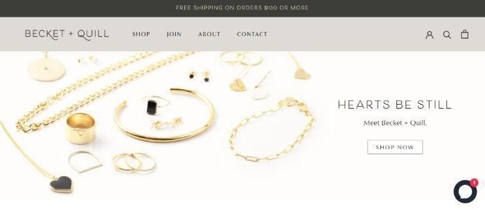
Coming in at even fewer words than Tiffany & Co., Becket + Quill has only 96 words on the homepage. They do also incorporate images, 18 in total on the homepage, including Instagram images just above the footer.
When looking at a 12-month of data, Becket + Quill brings in 632 organic visitors per month. This nets them a total of $434 per month in organic traffic value.
It’s no surprise they perform at a significantly reduced volume when compared to Tiffany & Co. After all, the Becket + Quill keyword universe consists of only 529 organic keywords, with only 28 ranking in positions one through three on SERPs.
Loveness Lee: Exploring Minimalist Web Design
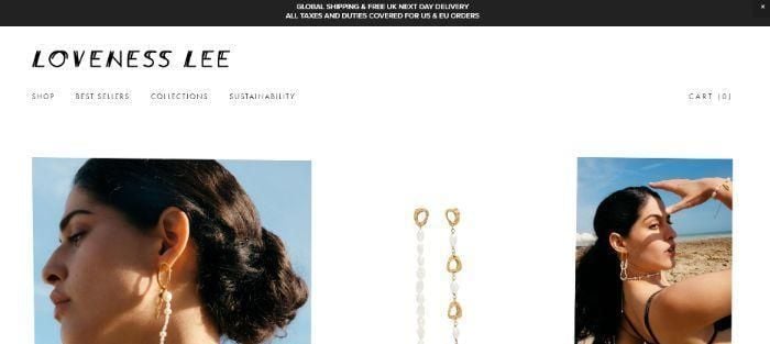
Loveness Lee is another jewelry website with a minimalist homepage design. That means 115 words in total (including words in the navigation) and 14 images plus one video banner.
How does Loveness Lee fare when it comes to organic traffic? Over a 12-month period, on average, Loveness Lee has 358 visits with a $2 per visit traffic value.
That’s not bad, considering the website ranks for only 254 organic keywords on average per month. Only three of those rank in the top three positions.
Minimalist Web Design in Action: David Yurman
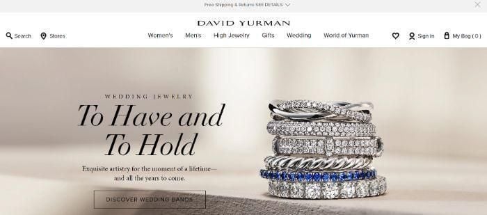
With a very similar word count and image count to Loveness Lee, David Yurman has 104 words on the homepage (including words in the navigation) and 17 images.
Perhaps you’d think David Yurman’s keyword profile would be similar to that of Loveness Lee. If you take into account domain rating, though (David Yurman’s 69 to Loveness Lee’s 39), it’s understandable why David Yurman’s keyword universe is so much more robust.
David Yurman has an average organic traffic volume of 439.7 thousand with a traffic value of $271.5 thousand per month. This is thanks to the website’s robust organic keyword profile, including 104.6 thousand organic keywords with 3.2 thousand ranking in positions one through three.
Bringing SEO and Minimalist Design Together: Blue Nile
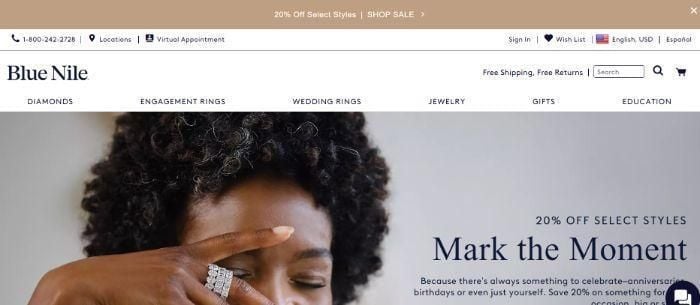
On the upper end of minimalist, Blue Nile is a good example of pushing the limits but still staying well within the boundary. Its use of white space, clean fonts, and clear typography make its robust word count appear minimalist.
The homepage boasts 616 words and 40 images including a mix of product imagery and graphics. Blue Nile has an average of 2.1 million visits per month with a traffic value of $2.9 million.
How does Blue Nile’s keyword universe fare?
Blue Nile ranks for 217.2 thousand organic keywords, with 28.8 thousand of those rankings in the top three positions.
How Minimalist Websites Support SEO: Taylor & Hart
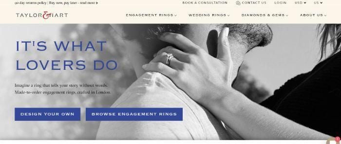
While not minimalist by our own definition, we’ve included Taylor & Hart for two reasons.
First, it’s important for us to compare the minimalist websites above with a non-minimalist website in the same industry. This helps to give us a greater perspective when it comes to drawing conclusions.
Second, it’s also good to see that a non-minimalist website can still appear minimalist and clean with effective design.
So here’s how Taylor & Hart breaks down.
The homepage has 928 words (including words in the navigation). The majority of this is in the form of a testimonial carousel that allows users to click through without being visually overwhelmed. It also includes 46 images, including product imagery, graphics, and images embedded within the testimonials carousel.
The monthly traffic averaged over a 12-month period is 117 thousand per month with a value of $115 thousand.
Taylor & Hart also boasts a robust keyword profile consisting of 72.1 thousand organic keywords. Of those, 2.8 thousand rank in the top three positions on SERPs.
Is Minimalist Website Design Good or Bad For SEO?
Before we answer this question, let’s consider the “winner” in the analysis above.
Blue Nile was the most profitable site, even beating out Tiffany & Co. for traffic value by $500 thousand per month. It had more words on the page than Tiffany & Co. (616 versus 190), a lower domain rating (76 versus 80), and even a smaller keyword universe (217.2 thousand versus 336 thousand). However, more of its organic keywords ranked in the top three results.
Can we say with certainty that the amount of content on the Blue Nile homepage was the sole contributor? Of course not. However, more content (when presented well) does mean more opportunities for optimization and customer engagement.
But is having more content the be-all-end-all to better rankings? No. If that was the case, Taylor & Hart would have been the clear winner.
With all of that said, to answer the question “is minimalist website design good for bad for SEO?” the answer is neither. There are many other factors at play. So as long as you’re optimizing the content you do have, whether that’s 100 words or 1,000 words, you’ll likely find yourself in a good place.
FAQs
Here are some answers to frequently asked questions on the topic of minimalist website design for SEO.
Does a modern website design hurt my SEO?
A minimalist or modern website design is unlikely to hurt your bottom line when it comes to SEO. There are many factors that go into SERP rankings, and web content is just one of them.
Does changing website design affect SEO?
Website design changes absolutely affect SEO, though how much will depend on the type and degree of changes that you are making. It’s important that you evaluate every change that you plan on making through an SEO lens so you can adapt accordingly.
How do I redesign a website without affecting SEO?
Chances are that site redesigns are going to affect SEO in some capacity, especially if you are making any changes to the site structure or UX. Because of this, it’s important that you audit your existing site and make changes that will allow for better SEO as part of the redesign.
Is a custom website better for SEO?
Most custom websites have better SEO performance than their free counterparts, largely because they are able to be built from the ground-up for search engine performance. With that said, custom websites can still have weak rankings if they are not optimized. Think of it in the sense that custom has the opportunity to perform better, but that opportunity still needs to be executed properly.
Does site architecture affect SEO?
Good site architecture is essential for SEO for multiple reasons. First, grouping relevant content together helps build context around the pieces, and helps search engines get a better idea of what your site is about. Also, a good site architecture makes your pages easier to crawl, so search engines can start ranking new content faster. Good site structure also helps with items like building backlinks and reducing keyword cannibalization.
What are ways to add more content without cluttering my website?
There are plenty of options for adding more content to your site without cluttering the design. These include carousels, accordions, and tabbed sections. You can also utilize more white space to offsite larger pieces of content.
Are accordioned or read more sections considered of lesser value to Google?
It does seem that Google crawls and indexes “hidden” content, like those in accordions or tabs. There is no clear answer on whether tabbed content carries less value. As long as you’re not purposely hiding content but are simply using it for the user experience, you should be fine.
Conclusion
Whether you have a minimalist website design, or you prefer a maximalist approach, you’ll be happy to know that what matters most is how you optimize the content you do have. There is not much difference between minimalist and maximalist websites in terms of SEO, as long as you’re following white hat SEO strategies.
Is a minimalist website design appealing to you but you already have an established website? A redesign is always a possibility. Fortunately, there are even redesign checklists available to ensure the project is a success.
from Neil Patel https://ift.tt/Ncbjm7t
via IFTTT
No comments:
Post a Comment